Reply With Quote
they look very similar to the previous one.
Not crazy about the Spurs one. Very similar to the old one, not enough innovation. The one that looks like it's in italics is ugly.

they look very similar to the previous one.
Not crazy about the Spurs one. Very similar to the old one, not enough innovation. The one that looks like it's in italics is ugly.

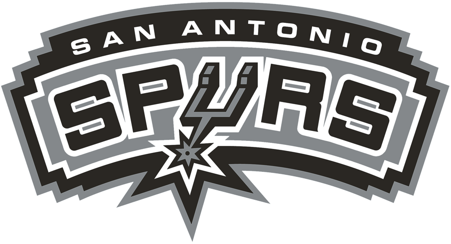
New:
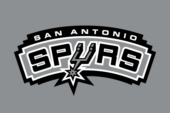
Old.
Last edited by BatManu20; 06-08-2017 at 04:11 PM.

Looks like the same logo to me.

Wait, what? Spurs have one of the best logos in the NBA as do the Chicago Bulls, if it ain't broke don't fix it.

Looks like those generic college logos on "'Fill-in-the-blank University' Athletic Department" t-shirts.

i'm just curious (and too lazy to look for myself) as to how many other teams other than the spurs don't incorporate a basketball into their logo.
Their logo is the Spur....

I choose the old logo.

Not a fan. trying to go old school/basic but it just looks cheap and lacks character
Only complaint is it looks a little bland. I wish the lettering was outlined, tbh. Something as simple as that goes a long way in visual aesthetics.

This was the best they could do?

exactly
new logo is fine, just simplified, neat tbh

Nah dude. The Spurs' "Spur" alone rocks, but this logo as a whole?
Is ugly as . The wording on the unis works flawlessly tho' as I love its spartan look.
I like this "new" font/logo. Looks clean.

would be the s if they use the san antonio on the black jerseys.

As long as they don't change the uniforms. Though this
would be awesome.

The background banner broke up with rest of the logo after bumping into Parker

Being more bland is a thing now I guess...

meh.

Thats where the NBA is going.

Is this to coincide with the switch to nike jerseys next season?
Looks ing
I like that the "San Antonio" part is more clear. I wish they'd rock the old Balck jerseys that just said San Antonio. Those where the

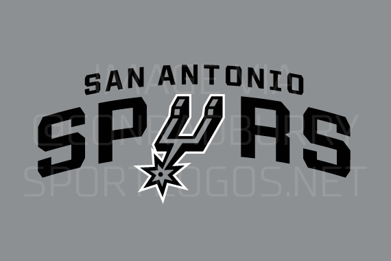
Wasn't a huge fan of the old one but also not a fan of the new one not being enclosed by anything/being nothing but letters. Agree that it's too bland.
If they wanted to be bland they should've just went with the Spurs U by itself as the primary logo instead of secondary.

It looks pretty generic
There are currently 1 users browsing this thread. (0 members and 1 guests)
 Posting Permissions