


 Reply With Quote
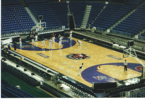
I actually like it, tbh


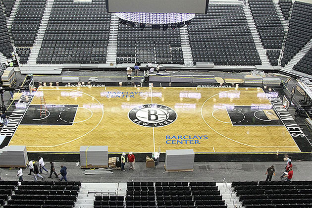
The Brooklyn Nets reveal their new, herringbone-patterned home court (PHOTOS)
By Dan Devine | Ball Don't Lie Tue, Sep 11, 2012 12:45 PM EDT
The Brooklyn Nets hope to fill at least some of those seats this season. (Photo via www.nba.com/nets)
There've been multiple pictures dropped on Instagram of late purporting to show the brand spankin' new basketball court at the Brooklyn Nets' brand spankin' new digs at the Barclays Center, a playing surface that will host the hometown squad for at least 41 contests (and, Nets fans hope, many more) during the upcoming season. The team removed all doubt as to what the court looks like on Tuesday, releasing a number of shots through its official website (and more through the New York Post) that ought to whet fans' appe e for the Nets' much-hyped opening-night matchup with their soon-to-be crosstown rivals, the New York Knicks.
Nets.com's Ben Couch has the details on the new court, which boasts a herringbone pattern that Nets CEO Brett Yormark trumpets as the team's attempt to develop a signature look rivaling the surfaces at some of the league's most recognizable arenas:
Designed by the Brooklyn Nets' creative team and produced at Connor Sports Flooring Manufacturing Mill in Amasa, Mich., the court will officially debut November 1, when the Nets open the season against the Knicks. It consists of 240 panels each measuring 4-feet wide, 7-feet long and 185 pounds; they took two weeks to construct, utilizing specialized milled lumber. The court takes four hours to assemble. [...]On one level, that's true; the mere fact of having a patterned home court should set the Nets apart, much as the fabled parquet of the Boston Garden (replicated in the TD Garden, the Boston Celtics' home since 1995) lent (and lends) a distinctive look and feel to every Boston home game. On another, the court's look only goes from "distinctive" to "cool and iconic" when you win a bunch of games and les on that court over a long period of time. Otherwise, you just wind up with a different deck that's associated with little more than losing, and could even wind up screwing with those fancy motion-tracking cameras you installed to try to help give your team an advanced analytical boost.
[Dwyane Wade is improving his shooting by working on his catching]
"The vision all along was to have something that was truly identifiable and unique and when people turned on their TVs at home, know they were in Brooklyn," Yormark said. "When you turn on the TV and you turn on a Celtics game and you look at that court, it's a parquet that has become very recognizable. We want this to be the same it's our version of the parquet. I think it truly delivered against all of our expectations."
As in most things, marching to our own beat tends to draw admiration only if you wind up at your destination faster; as with all things Nets, the time, attention, money and interest invested won't make a lick of difference if they don't win a bunch. Still, it's pretty.
Hit the jump for more photos of the brand new court at Barclays Center.
The center-hanging scoreboard welcomes Brooklyn residents. (Photo via www.nba.com/nets)
Honestly, I'm kind of surprised owner Mikhail Prokhorov didn't spring for a massive center-hung videoboard that would make the Houston Rockets' new Toyota Center display look like the screen you'd find on a Game Gear. Then again, if you buy every bell and whistle right out of the gate, you've got no upgrades to make down the line. I'm sure Barclays will be home to a Jerry World-style monstertron soon enough.
A look from above. (Photo via www.nba.com/nets)
The slightly darker finish of the herringbone-patterned court will probably make those Jay-Z-designed and heretofore-unrevealed (at least, not officially revealed) home white uniforms pop even more on camera.
Very social. (Photo via www.nba.com/nets)
The Nets are promoting their Twitter account on the sideline, aiming to drive traffic to a page that will reportedly offer team news, exclusive photos, offers and giveaways, and, if we're lucky, regular arguments with bored NBA writers that result in everyone calling everyone haters and trolls until, eventually, everyone just agrees that nobody is as good as Michael Jordan, which is basically the endpoint of every Basketball Twitter argument. Seems like a pretty good strat. (Here's hoping that every time Nets coach Avery Johnson sets foot on the @BrooklynNets logo, the Nets' game operations crew will play a small, adorable bird-chirp sound effect.)
A closer look at the Barclays Center court. (Photos via www.nba.com/nets)
Normally, to get this close to the court, you'd have to needlessly and ridiculously flop like your name was Reggie Evans.
A detail of the center court logo. (Photo via www.nba.com/nets)
This is where Brook Lopez and Tyson Chandler will jump for the tip on Nov. 1, 2012, unless Tyson uses his giant, ridiculous boots to step on Brook's peanut-brittle feet before the game. Then, anything could happen, really.
Asked for his opinion on the herringbone pattern and overall look of the Barclays Center court, Nets forward Kris Humphries said, "I think about its style as, like, London meets Italy edgy but, you know, classic at the same time." Oh, no, wait, he was talking about himself there, because of course he was.


I actually like it, tbh
They stole the Spurs colors

I like it.

I know you're poking fun but it actually does look like the Spurs arena with all the grey.
Spurs suddenly have two home courts.
Spurs already get love from the people around this area. This will just make it even sweeter.
Also I finally have a reason to visit Brooklyn. lol

The pattern of the wood looks pretty ty, like they just Elmers glued a bunch of strips of plywood together. I guess it matches pretty well with their rusting exterior though.
Orlando has pretty close to the same wood worked into their arena.
Not really a fan of the rugged arena look myself.

Sweet


looks ghetto

so this is where the Nets will get stomped night after night.

tbh I like it but those god damn mooks for stealing our colors and their colored rust building
The Oakland Raiders called...


Black and white are so boring for a sports team.

Kinda bland. Will have to see if the floor looks ed up on TV.

I like it. The floor pattern is original, but we'll see if it get old quickly.

The exterior looks like though
They built it with cut up panels from the top of UTSA's convocation center.

I like it

ty IMO.. one of those courts that hurts your eyes after a while of looking at it. I prefer something plain and light, like the Lakers court who have the best home court imo.. theres something about watching Laker home games thats easy on the eye.. same as the Spurs court aswell.

I agree the exterior and lighting looks terrible. Even if the floor looks good, everything around it makes it look kinda lame and boring.


Actually, no, it isn't original, tbh...
Nets

black and white seems fine for brooklyn, but i dont like that wood pattern, looks ty

The logo mark is okay at best. The fact that it is black and white would be fine if the design was at all interesting, but it's boilerplate. There's nothing to get excited about, because it's been done before. What they really needed to do was rebrand this franchise from the ground up. Ditch the ty "Nets" moniker and go with something more iconically New York. This had so much potential, but they went such a conservative route with it. If you're going to roll with such a plain and simplistic and expected logo mark, you better use some goddamn colors.

looks cool. wonder if they will chose white or black for the playoffs shirt giveaway

barklays center needs to be in different color...light blue?
There are currently 1 users browsing this thread. (0 members and 1 guests)
 Posting Permissions