Reply With Quote
About time. Those unis are fugly


http://www.nba.com/bucks/news/NewLook_060601.html
NBA Draft then in Sept.

About time. Those unis are fugly


I heard they are going to replace purple with red.

Green and red, just like their 1971 championship team.

No pictures avalible yet.
I've seen the new logo. It's similar to the current one, with red in place of purple, a darker shade of green, and a different, blockier font for "BUCKS."
Can you give us a link or something? Usually, these things are the worst kept secret, and the only reason why teams wait until September to announce the uniforms is because it is the most dead of all the months of sports.

I dont get what was wrong with the old logos. Seemed fine to me.
Bucks will unveil new logo at draft party
By Drew Olson
As reported several weeks ago here in Saucy Stadium Secrets, the Bucks will unveil an updated color scheme / logo during their draft celebration June 28 at the teams training center in St. Francis.
Given that the team holds the 39th overall pick in the second round, the updated logo will likely be the highlight of the evening.
Look for the Bucks to ditch the purple that theyve worn for more than a decade and replace it with red. It appears that new uniforms will be unveiled at a later time, but it seems likely the design will contain some elements of the uniforms the team wore during the 1970s and '80s.
http://www.onmilwaukee.com/sports/co...uni060106.html

Maybe they can give them little santa hats as well.

They should have just made their primary color orange, imagine the cross merchandising opportunities.
If that's the logo, I don't mind it. They appear to have changed the letter (no more 'wings' on the B and S in Bucks) and simplified the triangle. Although I thought it was a good move to go from a purple emphasis and a green accent, I think, for the uniforms, they should revert back to some of their older green incarnations.


These were awesome jerseys...
Every other one in that team's histroy sucks.

Maybe this new look will get them out of the first round of the playoffs next year.
I don't like the multi-colored sides. That's the only green jersey that doesn't remind me of the Boston Celtics. That's a good thing.
I don't like that either. It looks terrible with the dark red. It's kind of nauseating.
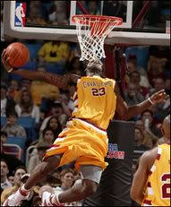
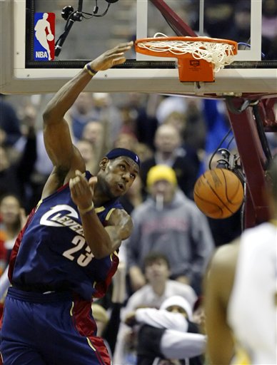
Maybe they can do to it what the Cavs did -
The actual throwback:
Their blue alternate which has similar sides:
That's not too bad; it's not quite as clashy as that multi-shade army green on the red uniforms. That just sucks.

good, those ones they had sucked.
There are currently 1 users browsing this thread. (0 members and 1 guests)
 Posting Permissions