
 Reply With Quote


You don't want to learn the truth?

Don't have time to address the Hansen thing fully other than to quickly point out that the article Yonivore linked is full of some quite horrendous data or out right lies. I'll explain why later.

You don't want to learn the truth?

When you do, could you also explain how an error bar that spans 112.5% of a whole is considered "fairly small."
Take your time, you're a busy man -- having fun, I hope.
You're a loser and a moron.
"of a whole"
Doesn't matter what he says. It'll be a waste of time. You can't fix stupid.
If you measure something at 1.6 units with an error bar that spans 1.8 units, I'm not sure calling the error bar "fairly small" is an accurate statement.
Incorrect. That completely depends on what the units represent and the scale of said units.
Easy example is celsius around freezing. If the reading is 1.6 degrees with a 2 degree margin of error then that is clearly a small margin of error. Additionally, said degree of error gives you a range of possibilities to apply risk management to.
One thing that is clear is that you have no conception of risk management or statisitics. That is expected as law enforcement does not require that you know it.
If the baseline is 0 (as it seems to be in Manny's chart) and you measure something at 1.6 units with an error bar that spans 1.8 units, that's not a "fairly small" margin, relative to the measurement.
I think it will prove to be much higher. The fao used to use 20-25% as the figure. Then there was a study that lowered it to around 15%. Those numbers only account for co2 released through deforestation not co2 increase due to loss of a carbon sink.
I found this article which would indicate the amount of co2 increase due to deforestation is probably higher than you think.
They discovered that the worlds forests currently remove 2.4 billion metric tons of carbon each year from the Earths atmosphere, which they believe to be equivalent to one-third of the planets annual fossil fuel emissions. They also discovered that deforestation for development, to generate fuel, or for other reasons emits roughly 2.9 billion metric tons of the greenhouse gas, or "more than a quarter of all emissions stemming from human activity" each year, according to AFP writer Marlowe Hood.
http://www.redorbit.com/news/science...er_of_forests/
All you did was repeat yourself. As I said it depends on the unit and the base. i just gave you one example of a baseline of zero that obviously was a small margin of error.
If you want to make a compelling argument then you are going to have to be more specific and detailed such as discussing the range, units of measurement etc.
In this particular case, your interpretation of the stats is very flawed.
a) the estimate given was 1.6 with a range of .8 to 2.4. Thats a margin of about +/- .7 not 1.6.
b) that figure was extrapolated from multiple sources each with it own degree of error. Soot has a margin of error as does CO2 etc. Each one compounds the error in the end calculations and has to be calculated in the final tally. Its similar to the notion of what the probability of winning the lottery is when you add ping pong balls.
c) Nothing in this life is certain. There is a degree of uncertainty in everything even the most exact of sciences.

LOL...
FuzzyDumbDumb doesn't get it.
You are talking about that, right?
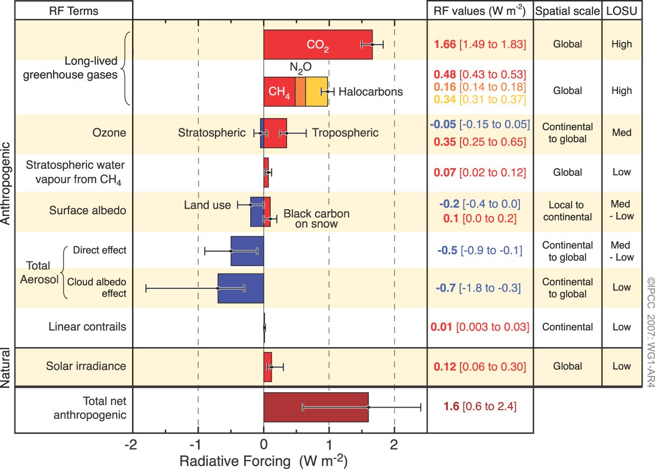
A total charted net anthropogenic radiative forcing given as 1.6 with a range of 0.6 to 2.4....
I guess in fuzzy math, 2.4 - 0.6 ≠ 1.8.
Looks like a span of 1.8 to me, but what do I know. Fuzzy disagrees, so we must be wrong.
http://en.wikipedia.org/wiki/Variance
Yup you still suck at statistics. If you need me to bold the salient point for you just let me know.
Will someone please define what "span" means to FuzzNutz. He won't listen to me.
When determining error you evaluate from the expected value. Span is an arbitrary term indicating some length between two points. The span from the expected value to the limit of error is a span.
It's not my fault that you guys have no clue on the subjects you are talking about.
Wow...
The idiot does know what span means. I'll bet he googled hard for it. Considering he said Yoni was wrong about the "span" of the range, I wonder whats moving through that pea sized brain to justify his cyber bullying now. Maybe worms?
There was a span from 2000 to 2010. Was there also a span from 2005 to 2010?
Span is arbitrary. I made the assumption that you were talking about span from the expected value to the outer limit. Instead you were talking about the span from one outer limit to the other.
I made that assumption because when you are talking about error you talk about the deviation from the expected value. You are just talking in a way that makes the error look larger than how error is viewed in science and statistics.
I also noted that you guys completely avoided the discussion of compounding probabilities. All you guys are doing is handwaving at the largest error value which happens to be a sum of all the other cons uent errors. You conveniently ignore that the degree of error as to the anthropogenic contribution from GHG is relatively much, much smaller.
The highest level of uncertainty has to do with the mitigating effects of albedo so in essence what you are doing is betting that the effects of aerosols is going to be much greater towards mitigating the much more certain contributing effects of GHG emissions.
That's called confirmation bias.
Maybe if you tried to have an actual discussion with people instead of always trying to find or fabricate fault in others, you wouldn't look so stupid.
Actually, the span about which I'm talking is from the minimum of the error bar to the maximum (not from the expected value to one or the other extreme) and, it really doesn't matter if it's a ulative, or the product of, other bars; if you tell me there are 16 anythings in a box but, due to confidence issues, it could be as few as 6 and as many as 24, that's not a "fairly small" error bar, is it?
When I first looked at that Hansen critique I knew the temp line was off because it was highest at 1998. That is not the case in any of the 4 temperature datasets out there. I didn't realize there were more errors than that right off the bat but Darrin and Poptech's favorite site put up a post on the subject.
http://skepticalscience.com/simply-w...hansen-88.html
The most important parts:
- The link Yoni posted compares the temp to Hansen's hottest scenario, A. The scenarios are governed by emissions levels and the real world emissions are much closer to Hansen's B or C scenarios which are both noticeably cooler due to a lower amount of GHGes emitted into the atmosphere. Why would you compare against the hottest projection when emissions do not match it?
-When you compare the temperature datasets with scenario C, they are right in line. They are below what scenario B calls for, but by about 40%. This is actually in line with what modern literature believes the CO2 forcing is. In 1988 Hansen believed it was larger than what we believe it to be today.
How many of you have a computer in 1988? Thats about Apple IIe time. Now, imagine comparing that type of computing power to what we have today. Climate modeling was obviously not nearly as strong 25 years ago as it is today. That being said, given what we know about CO2 today, Hansen's model is still pretty damn good.
If the science is so god damn bad, why do "skeptics" need to outright lie when talking about its performance?
Forbes Still Publishing Heartland’s Climate Nonsense
A recent Forbes column alleges that federal scientists are "doctoring" temperature data to fabricate a warming trend, after the National Oceanic and Atmospheric Administration announced that the last 12-month period was the warmest on record for the continental U.S.
But what the column paints as a nefarious conspiracy is actually just proper science -- NOAA painstakingly applies peer-reviewed adjustments to account for errors and gaps in the raw data from thousands of temperature stations across the country. The resulting temperature record has been independently evaluated and corroborated.
The column is by James Taylor of the Heartland Ins ute, the libertarian group that recently made headlines with a short-lived billboard campaign tastelessly invoking the Unabomber. This is not the first time Taylor has used his platform at Forbes to malign scientists and spread bad information about climate research.
At issue are the corrections NOAA uses to eliminate errors and known sources of bias from the raw weather station data (which Taylor likes to call "the real-world data"). Keep in mind that the U.S. represents just 2% of the Earth's surface so the data we're talking about are a small part of the evidence of global climate change.
The scientists (Taylor calls them "bureaucrats") know that the raw data have flaws -- stations are moved, natural disasters knock stations offline, measuring instruments change -- so NOAA performs quality control using methods that are published in peer-reviewed papers. Taylor concedes that "it is, of course, possible that certain factors can influence the real-world temperature readings such that a correction in real-world temperature data may be justified." But when he doesn't like the results, he concludes that the adjustments aren't valid corrections but "doctored data."
Against NOAA's rigorous science, Taylor offers his "common sense," which tells him that any corrections should, in fact, reduce warming:
Common sense indicates that if the real-world data need adjustment, the proper adjustment is to further reduce recent temperature readings. Yet the bureaucrats who oversee the data have instead doctored the data to show a false, long-term warming pattern.
How does Taylor, a lawyer, know what "the proper adjustment" is? He simply asserts that if there are factors biasing the data, "The most important such influence is the growth of towns and cities around temperature stations." The urbanization would cause the raw data to show more warming than actually occurred and the adjustment should decrease that warming, according to Taylor. But a quick search on NOAA's website shows Taylor is wrong. The most important bias is not urbanization, as Taylor assumed, but a change in observation times. NOAA explains:
The most important bias in the U.S. temperature record occurred with the systematic change in observing times from the afternoon, when it is warm, to morning, when it is cooler. This shift has resulted in a well do ented increasing cool bias over the last several decades and is addressed by applying a correction to the data.
It may not be common sense, but if common sense were good enough, we wouldn't need science.
NOAA's David Easterling also said via email that "Urban warming is a very small part of the overall warming, which also has been do ented in the peer reviewed literature." Easterling added, "The conclusions of the column sound like pure speculation on the part of the writer."
Still suspect a giant conspiracy or massive incompetence at NOAA? Take it from physicist Richard Muller, who led an independent assessment of the surface temperature record last year. The study was partly funded by the Koch family, the oil tycoons who, incidentally, have also supported the Heartland Ins ute. Muller said via email that "it would be ridiculous" not to adjust the raw data. While noting that "some of the adjustments were made by humans using criteria that are somewhat subjective," Muller said his own study produced "results that are very similar to those of the NOAA and NASA groups," which indicates that the corrections are "done in an unbiased way."
Muller's research also showed the effect of urban heat on the data "is minuscule because the urban heat islands are very small in area, and they contribute little to the overall land average."
As outlined by a comprehensive report commissioned by the George W. Bush administration, climate change in the United States shows up in several other observations aside from the temperature data:
Climate-related changes are already observed in the United States and its coastal waters. These include increases in heavy downpours, rising temperature and sea level, rapidly retreating glaciers, thawing permafrost, lengthening growing seasons, lengthening ice-free seasons in the ocean and on lakes and rivers, earlier snowmelt, and alterations in river flows. These changes are projected to grow.
If we're in a "long-term cooling trend" as Taylor claims, he's got a lot to explain, and flimsy charges of "doctored data" aren't going to cut it.
http://mediamatters.org/blog/201206180001
If it's Kock Bros paying, you know their funded orgs are lying.
There's some serious failure here on many aspects. First of all, I never claimed the ulative error was "fairly small". I claimed that many of the error bars - most in fact - are small. If you look at the GHG forcing there is little doubt as to how much is being caused.
I explained that current clouds are the biggest unknown in the system, so its pretty easy for most people to understand that when you add in a variable that is not understood perfectly you're going to be introducing a larger error which is why the ulative forcing (which includes clouds) shows a larger error bar than almost everything outside of clouds themselves.
There are some seriously poor understandings of statistics on display here. Each possible value within those error bars is not created equal. You should expect about 70% of the possible values to be VERY close to the center of those error bars. As you get further away from the center value, the chance of a value within those error bars being correct drops off quite a large amount. Scientists include the fringe values because even though they have a much lower chance of being correct, they hold a very high standard for accuracy.
Furtheremore, those forcings are not created equal! Some are continental or local which others are global. So, in areas which high levels of pollution (ie China) you're going to see higher levels of aeresols and in turn they are going to have a higher net affect. If you took measurements in China, you would get a lower level of net energy change due to AGW because of this. However that does not mean that is the case around the entire globe. However, this regional difference factors into the error bars as well because its an actual data point in the data used to calculate global forcing.
The error bars for the GHG are the most important things on that chart as well. Why? Because those values are not for a point in the future when CO2 is much higher. They are for the date of the IPCC publication when CO2 still hast not reached levels that have caused a great deal of warming. As time moves on and CO2 concentrations increase, the forcing from them obviously increases as well. As that forcing increases, the total forcing also increases. Even if the error bars for stay the same (and this is what Fuzzy tried to explain to you) when you shift that total forcing to higher levels you're looking at an energy level that provides you with a lot of heating at the low end of the error to an energy level that provides you with even more heating.
Failure to understand basic stats often leads to misunderstandings like this.
The IPCC caption from that figure:
Figure SPM.2. Global average radiative forcing (RF) estimates and ranges in 2005 for anthropogenic carbon dioxide (CO2), methane (CH4), nitrous oxide (N2O) and other important agents and mechanisms, together with the typical geographical extent (spatial scale) of the forcing and the assessed level of scientific understanding (LOSU). The net anthropogenic radiative forcing and its range are also shown. These require summing asymmetric uncertainty estimates from the component terms, and cannot be obtained by simple addition. Additional forcing factors not included here are considered to have a very low LOSU. Volcanic aerosols contribute an additional natural forcing but are not included in this figure due to their episodic nature. The range for linear contrails does not include other possible effects of aviation on cloudiness. {2.9, Figure 2.20}
Some understanding on distributions - including error distributions.
http://en.wikipedia.org/wiki/68-95-99.7_rule
Thanks for posting the "most important parts;" hopefully, that'll keep you from moving the argument when I say, despite the bunch of words you just posted, Hansen still overestimated the temperatures in 1988...in all three scenarios (none of which were hidden from the forum and appear in the graph I posted with the article).
Rarely, if ever, do AGCC proponents underestimate. It's all about the sensationalism. Polar bears, glaciers, the snows of Kilimanjaro, etc... But that's a whole other topic. Scenario A was the one latched onto by alarmists and used to try and beat the world into the environmental religion of AGCC.
By the way, in 1969, the Apollo 13 astronauts maintained a trajectory -- that brought them back to Earth -- using a slide rule. That's 19 years before Hansen botched the math on climate and started this climate hysteria nonsense we're having to deal with today.
All that to say, "It's Kentucky Windage."
There are currently 3 users browsing this thread. (0 members and 3 guests)
 Posting Permissions