Reply With Quote
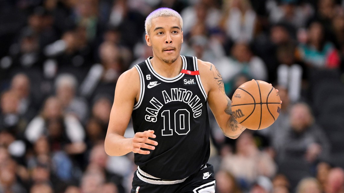
won't be those. We are getting grey jerseys

Noooo, not the LGBTQ Trailblazers jersey

won't be those. We are getting grey jerseys

Holt’s niece straight to the unemployment line
Never liked the SATX thing, though gotta say the rest of the jersey looks rather clean.


Bring back the silver unis!
Those mocked up Gray Statement unis look like a flat, bold look… kind of like UTAH’s black “UTAH” kit with yellow lettering. It isn’t flashy, but I dig it.


Still kinda of boring, but way better than last years. And if your going to do grey, excluding the white is the way to go. Approved.

I'm just happy not to see SATX anymore, always made me think they were trying to blend San Antonio with Austin.
I like these though!
Someone did a mock design.
it doesn't get more boring than that

trash. minimalist designs are awful for NBA jerseys

Disagree. That's a summer league jersey.
Yeah, I don't like it. Not a Jersey that is up to snuff for actually wearing in real games.

Looks like the trash shirts that you see at Ross Dress for Less.

Can we just dump the last 15 years and go back to the 2000s when basketball and everything about it was at its best? Dump the ads on jerseys, three point chuckfests, seven seconds or less, little to no defense garbage excuse for basketball. Bring back the 00s Pistons and Spurs style basketball and only allow one alternate jersey per year and a strictly enforced limit on those. Also, no more gimmicky alternate painted home courts, it's ugly and a waste of time and money.
Adam Silver drove the NBA into a quicksand ditch and it's never recovered. With Stern you had rigged games, corrupt refs paid by the Italian mobs, less parity etc, coaches had to creatively design offensive schemes like they do in football and games were more strategy and system oriented rather than the pure make-or-miss SSOL chuckfest league it is today..... but it was at least watchable and so much better.
The white undershirt throws the look off but with a black one I think it would look good.
That would help for sure, but not all players wear shirts underneath. Without one, it's going to look pretty average IMO.
it says it's a mock up by someone. That means it's not the real jersey. I'm sure they will at least add some of the colored stripes on the sides. At least I hope so.
upclose it does look even plainer. Hopefully they atleast put some pinstripes. But still way better than those god awful grey ones with the huge spurs logo.
As-is it's one side of a reversible jersey you wear at Vegas with black shorts.

Not really sure why theres disappointment in this thread but these grays may well be the best alternative jerseys theyve worn since they started alts in 2003. Gervin throwbacks I dont even count bc they are retro authentically.
Id imagine theyre going to look even better on the court and San Antonio being the only style element is the best part.
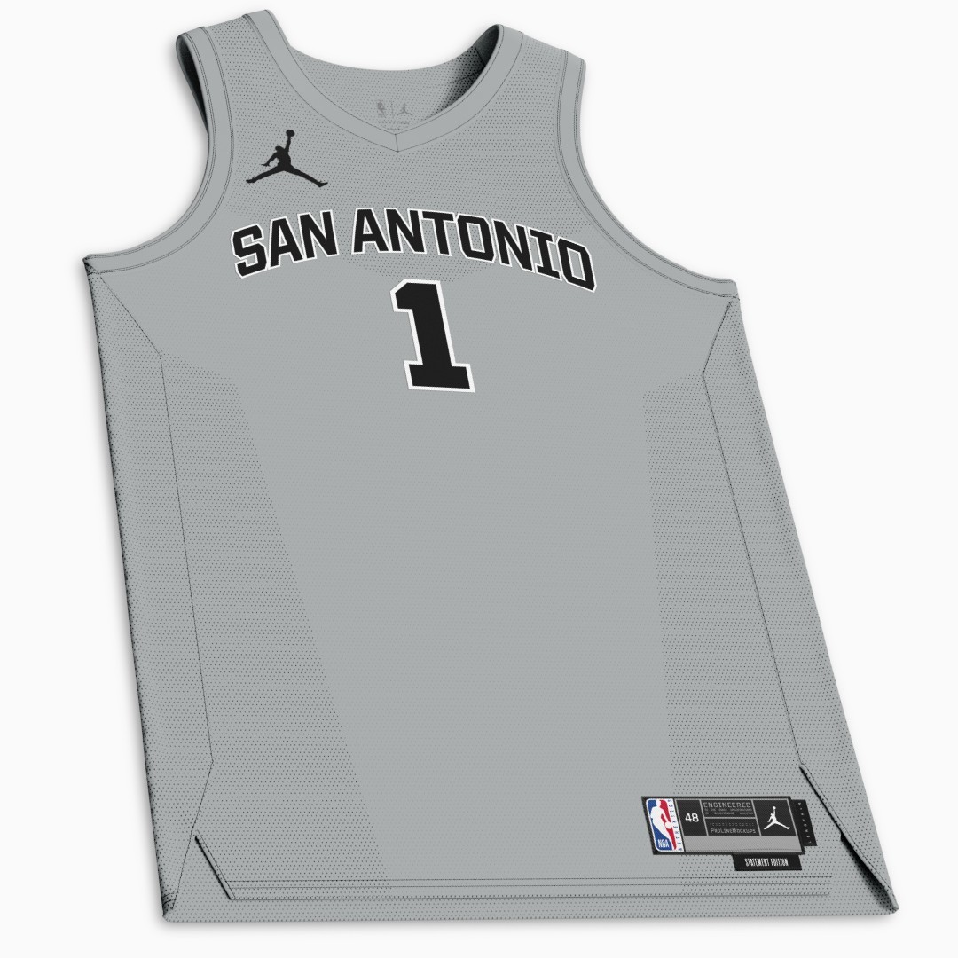
absolutely atrocious. But we always have at least one ugly jersey anyway. Spurs design department has always been one of the worst in the NBA.
Spurs have amazing colours to work with, but yeah, I think drop the ball quite often in regards to what they can do with the Jerseys.
There are currently 1 users browsing this thread. (0 members and 1 guests)
 Posting Permissions