I'd rather they resurrect the Hemisfair Arena, tbh.


That Letterman Jacket is A++


Also ing terrible

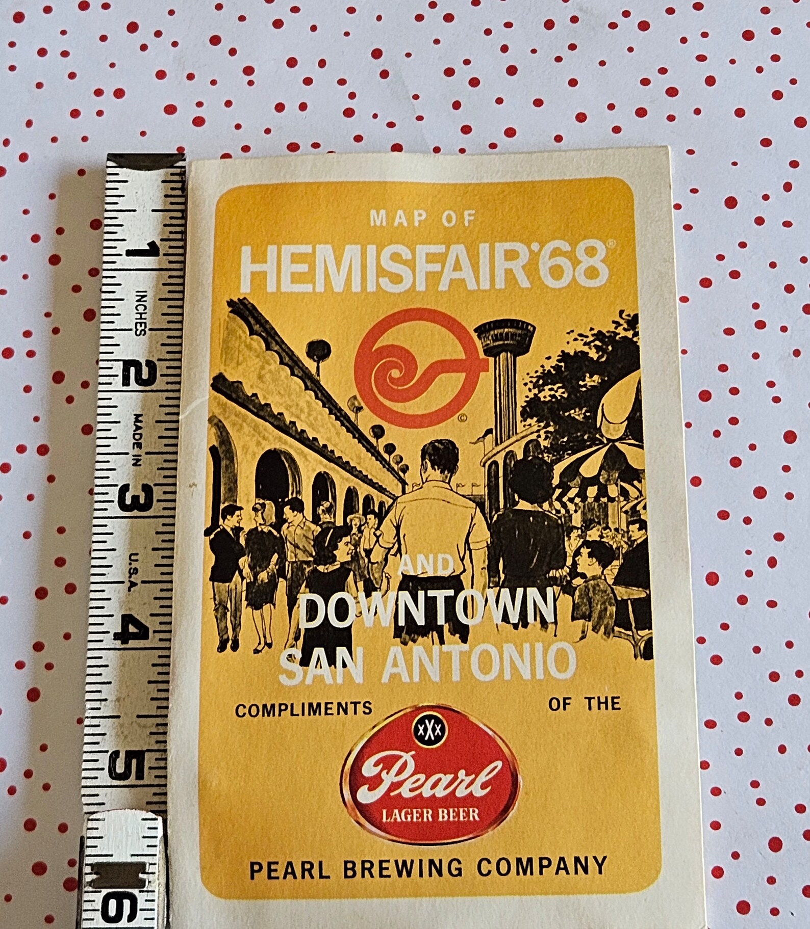
I don't see any brown in that poster at the top

Honestly just take the brown off the court and throw some sixties bull pattern on the jerseys and we have a deal
So yall don't like Mexicans duly noted

That court is in no way Mexican in origin. Try southwest native American, hence all of the comments about Albuquerque.
It was a comment at not liking brown


Damn, Wemby and Keldon changed numbers?

The branding for this team has nose dived over the last decade ouch
Yeah you can actually wear that casually for a night out and not look like you are wearing your favourite team’s sporting gear.

Uhh... they took the Cavaliers jacket / colors and just added a pink spur. WTF?
Not bad. Hats clearly for a younger crowd, but they look clean too.

Saul's good man!

Man the Spurs are really dropping the ball in creative design lately. The uniforms last year and now this? Not good.

I actually thought the SATX unis weren't terrible. The design on the sides was cool but the main logo on the front was a little wonky. These jerseys though are just hideous

That jacket is fire.
Horrible. Pumpkin e jersey.

they almost look ABAesque, or from some make believe basketball team that would have been featured in a 1970's film about a basketball team.

The Flint Tropics had better uniforms than these uninspired duds.
There are currently 1 users browsing this thread. (0 members and 1 guests)
 Posting Permissions


 Reply With Quote