

 Reply With Quote
Nobody looks good in gray bro (maybe charcoal). Who wants to buy that ?

White outline is a step in the right direction. Needs some piping IMO.
Nobody looks good in gray bro (maybe charcoal). Who wants to buy that ?

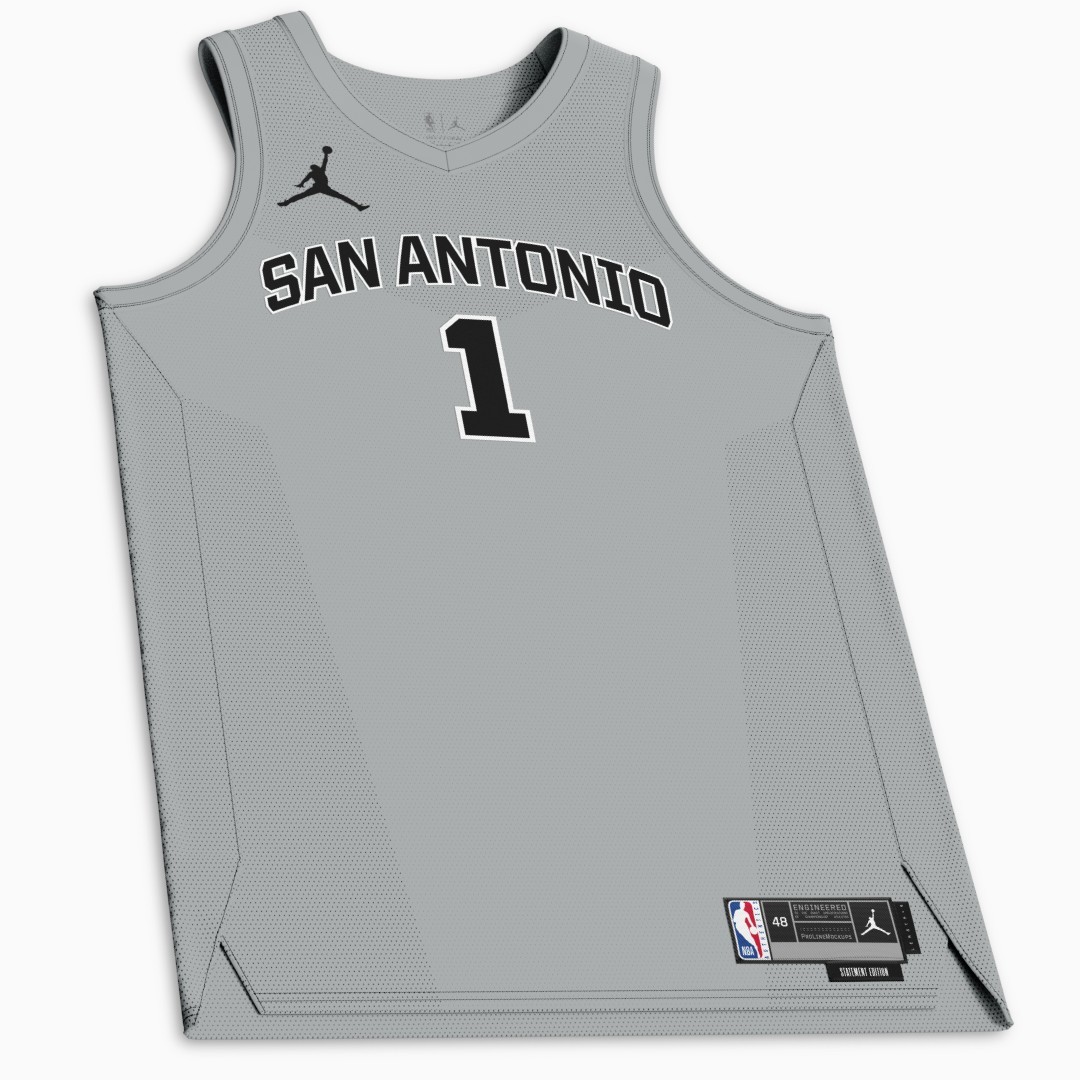
The person who made the mock-up of the statement jersey stated that it isn’t complete. It only has the color, wordmark, and number. It doesn’t include the striping and trim. So this assumption about a minimalist jersey probably isn’t correct. It could just be a recolor of the association and icon jerseys. It could have striping/trim like the 2010’s gray jerseys that had the big spur on the front. Or it could be something else.

I like them. Huge improvement over SATX and Bill Miller alts

First year of the Hemisfair jerseys was dope. Second year same but with the ugly leisure suit color was ass.
I actually think they’ve all gotten progressively worse since the first Black Fiestas (which are GOATed in my mind)
The “White Fiesta” that followed should have just been a literal white version of the Black Fiestas, but they got cute and really dropped the ball. The Teal Fiestas that followed with that Fred Flintstone font was a major miss IMO as well, and then I personally hated both Bill Miller editions. I never need to see Brown and Orange on a Spurs jersey.
The Spurs have a few absolute bangers in their repitoire that honestly I wish they would just rotate through and not use anything else: Black Fiesta, Gervin Era Black-on-Black San Antonio, 2015-17 Christmas (one white, one black).
Here is the whole history for folks who like to look back: https://basketballjerseyarchive.com/...jerseys/#2010s
I didn’t hate some of the camo editions (just no sleeves, please), but it definitely got played out over time… I wouldn’t mind a camo snuck into the rotation as a nod to the city’s military tradition.
Another one I kind of like, similar to the Gervin Era black-on-black, is the late 80s road editions.
I really liked the white fiestas but yeah the teal were horrible. Hated all the camos and never liked any of the Christmas gear. The SATX are the worst jerseys they have ever had, even worse than the Chaps throwbacks or those ugly glossy silver ones from 2004. Kind of wish they'd bring back either that gray and black like they wore when Tony hit the gamewinner on the Thunder to begin the 2012-13 season or the black on black version they wore when they skull ed Golden State in Durant's first game there.
I would have loved that site 20 years ago when I used to make a bunch of jersey and court patches for NBA live.

Forgot about the Christmas joints back in the day. Plain works if its the right markup. Only would like the city name in larger font but it being so long it would ape the okcrefs road jerseys


Saying that the jersey is generic is an understatement. Hope this isn't the final version. At least put a spur in there somewhere. Is this a summer league practice jersey ?
Dull generic dull. Hate to complain so much, but a 4th grader could probably design something better.

these were absolutely fire. I also like the 2017 black on black ones

I like those new greys. Nice and clean.
Those greys in the 2012-2016 era were my favourite jerseys.

I think the grey one is going to look sleeker when they do the actual release of it.
Side Note: Do we think Keldon (assuming he stays this year) changes his number back to 3 if CP3 does in fact leave?
I hope Keldon doesn't get a number...

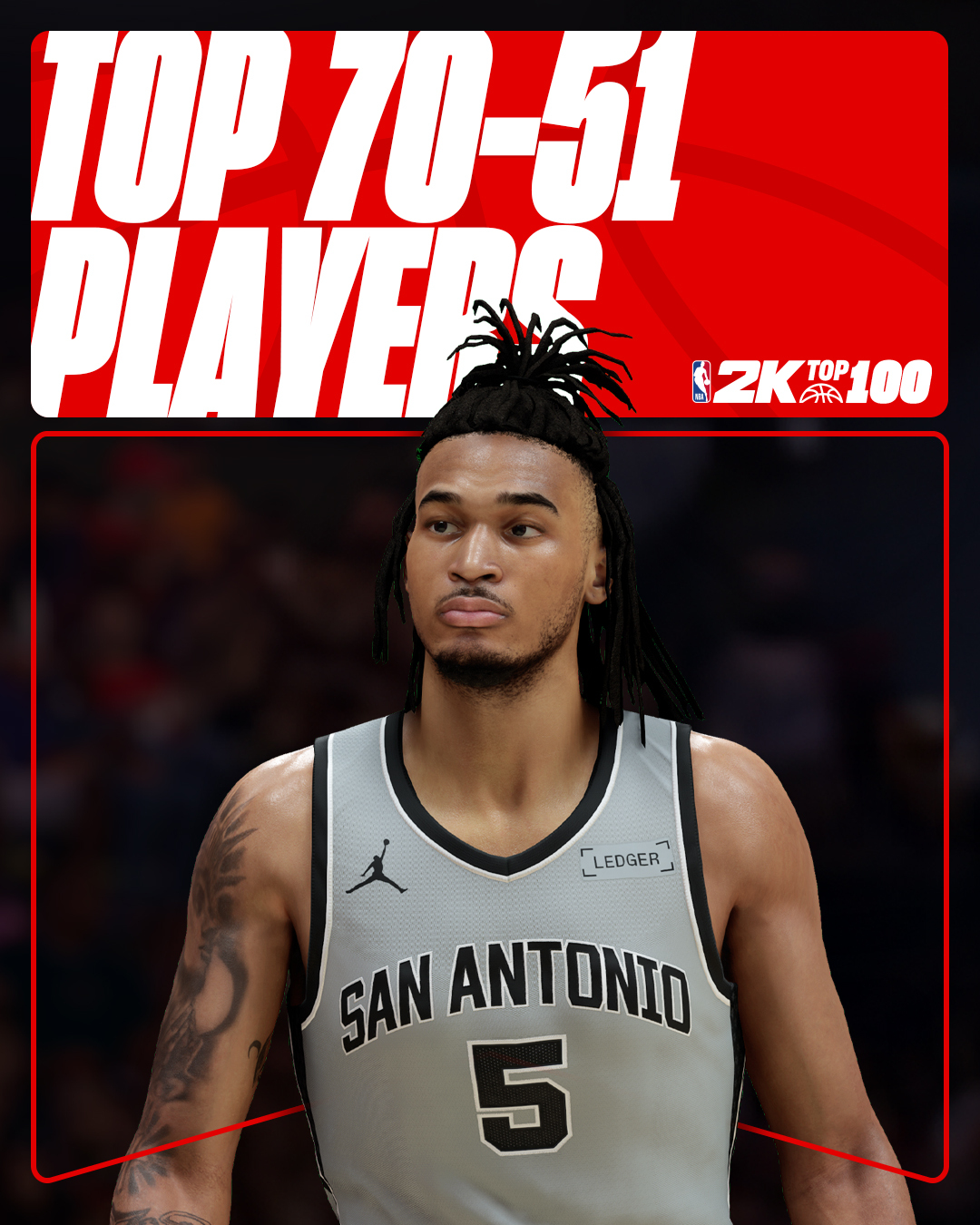
Per NBA2K

Meh. Those are so basic looking
Is it me or do 2k's graphics look no better than they did in 2015?

As posted in the other thread, I'm down with it. Back to the basics.
Silver, black, and white. That's all we need.
Too much black in the trim but I'm comparing it to GOAT Gervin era jerseys.
There are currently 1 users browsing this thread. (0 members and 1 guests)
 Posting Permissions