Page 3 of 3 FirstFirst 123
Results 51 to 62 of 62
  1. #51
    adolis is altuve’s father monosylab1k's Avatar
    My Team
    Dallas Mavericks
    Post Count
    15,826
    Professional sports teams need to stop making new logos/uniforms every couple years just to help merchandise sales. It's stupid. Teams are changing all the time, and a lot of times, it's unnecessary and even dumb. Classic colors and logos should stay relatively consistent. Look at the Lakers, Knicks, Cowboys, Packers, Yankees, Red Sox, Red Wings. Minor style changes are one thing. But, completely overhauling uniforms takes out some of the classic looks of teams. Sometimes, it needs to be done, like with the Nuggets and their rainbow rocky uniforms. But, most times, they don't need to be done. I like the classic red and yellow Hawks colors.

    I still cringe over the Pistons' "teal era."

    It's incredible that the Broncos trashed their classic look and have stuck with those ugly ass uniforms for a decade now. Hopefully one day they catch on and realize it.

  2. #52
    Veteran
    My Team
    San Antonio Spurs
    Post Count
    2,869
    It's incredible that the Broncos trashed their classic look and have stuck with those ugly ass uniforms for a decade now. Hopefully one day they catch on and realize it.
    You dont like the Broncos unis? I think they're sweet. They are the ones we copied off with our football jerseys for highschool, I loved em.


    But I dont think any of this is really a big deal, however a team wants to look should be thier choice. I really dont pay much attention to uniforms and logos and all that. Although I will admit its a little cooler to like the Spurs without pink.

  3. #53
    GTL: Gym, Tan, Laundry Thunder Dan's Avatar
    My Team
    Cleveland Cavaliers
    Post Count
    7,666
    Professional sports teams need to stop making new logos/uniforms every couple years just to help merchandise sales. It's stupid. Teams are changing all the time, and a lot of times, it's unnecessary and even dumb. Classic colors and logos should stay relatively consistent. Look at the Lakers, Knicks, Cowboys, Packers, Yankees, Red Sox, Red Wings. Minor style changes are one thing. But, completely overhauling uniforms takes out some of the classic looks of teams. Sometimes, it needs to be done, like with the Nuggets and their rainbow rocky uniforms. But, most times, they don't need to be done. I like the classic red and yellow Hawks colors.

    I still cringe over the Pistons' "teal era."
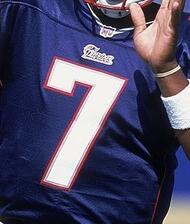
    Look at the Cleveland Browns. Those are the definition of classic colors. I bet they would sell more merch. to out of market people if their colors wern't so ugly. But if your a Browns fan you love them. Every time they do a list of ugly and best uniforms, they are always on both.
    Last edited by Thunder Dan; 06-25-2007 at 09:56 AM.

  4. #54
    Hedo Layup Drill ShoogarBear's Avatar
    My Team
    San Antonio Spurs
    Post Count
    39,519
    Look at the Cleveland Browns. Those are the definition of classic colors. I bet they would sell more merch. to out of market people if their colors wern't so ugly. But if your a Browns fan you love them. Every time they do a list of ugly and best uniforms, they are always on both.
    Penn State.

  5. #55
    Tim to Tony to Manu! bdictjames's Avatar
    My Team
    San Antonio Spurs
    Post Count
    5,686
    Its pretty much like the USA Team jersey. I hope that helps them win games.

  6. #56
    Late 2nd round pick cecil collins's Avatar
    My Team
    San Antonio Spurs
    Post Count
    1,151
    They look fine. A little on the bland side, but whatever. These, on the other hand, are not only awful, but creepy and weird:

    Yeah, those look ty, but the new blue is terrible.

    They should have gone this route:
    Josh smith yellow
    I personally thought the newer red was cool also.

  7. #57
    Murdering Prostitutes Findog's Avatar
    My Team
    Dallas Mavericks
    Post Count
    21,565
    Yeah, those look ty, but the new blue is terrible.

    They should have gone this route:

    I personally thought the newer red was cool also.
    busted link.

  8. #58
    Late 2nd round pick cecil collins's Avatar
    My Team
    San Antonio Spurs
    Post Count
    1,151
    Yeah, I tried to fix it, but I suck.

  9. #59
    Start Dice The Red Hood's Avatar
    My Team
    San Antonio Spurs
    Post Count
    805
    Hey Spurs Rock when did Shawn Michaels do that?

  10. #60
    Believe.
    My Team
    San Antonio Spurs
    Post Count
    959
    Atlanta should of gone back to their 80's logo. It was actually good.


  11. #61
    GTL: Gym, Tan, Laundry Thunder Dan's Avatar
    My Team
    Cleveland Cavaliers
    Post Count
    7,666
    This is what they need. I'm tired of this futuristic bull teams try to pull off every year. Notice how good teams usually don't have to do this.


  12. #62
    Dr. Pepper Johnny_Blaze_47's Avatar
    My Team
    San Antonio Spurs
    Post Count
    24,692
    I actually dig the secondary logo on the back of the jersey collar.


Thread Information

Users Browsing this Thread

There are currently 1 users browsing this thread. (0 members and 1 guests)

Posting Permissions

  • You may not post new threads
  • You may not post replies
  • You may not post attachments
  • You may not edit your posts
  •