

 Reply With Quote
hipsters and their minimalist logos

Sad thing is that most fatties in SA would love those unis.

hipsters and their minimalist logos

It reminds me of the Nike Basketball logo.
Should have but Jonathan Simmons' marketing team on the task.

I don't mind it, just the spacing of the spurs lettering is too far apart.

I hope Manu Ginobili plays in 2018 just so I can buy this exact jersey.
The Nike and HEB logos are actually really attractive to me strangely enough.

Aside from the Nike logo actually in the plans for every NBA Team, I wonder how else our jersey will change.
Look for the Spurs to reveal everything in late July / early August.

Looks worse

Why would there be a Ginobili Spurs jersey in 2018? lol he's done. Is that what his team is wearing in the Salvadorean Basketball Association?

Isn't Charlotte - and maybe Chicago - going to have the Jumpman logo instead of the Swoosh?

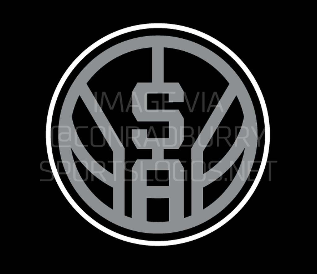
My tweaks to the 3rd logo lol


Did a quick Shop for comparison:

Just noticed you used the copperplate font for the years... that's the font the Warriors use
Golden State Warriors numbers font

I think some of this is to both remove the focal point of the jersey as the franchise name, so that sponsors get some notice when their starts appearing, and to make room for said sponsor logos.

I'm happy they are moving away from Adidas to Nike, but the sponsor on the jersey is such a buzz kill no matter how small it is.
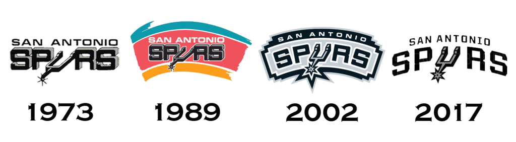
As far as our new logo, I don't like it one bit.
I rather have had something related with a cowboy boot & Spur if it came down to it.
I'm okay with the secondary logo. It's a little too plain, and was hoping they would be pushing more towards silver and black, then white & black.
Way better than whatever the the 2002 logo was supposed to be... only thing I hate is the alternative "basketball" logo.

Surprised they used #8 instead of #9...

This tbh
And it is not as if they deviated or radically changed the design from the main style and purpose. Casual/playoffs fans won't even notice the difference in the unis. IMO they cleaned that 2002 ribbon thing up or whatever that meant.

I'm gonna get the 2017 logo as a tattoo. I like it!!
Are you thinking about that patch every team wore in 2001-2002?


Phone wallpaper.


this is such ass. Horrible.
New primary logo is clean AF tho.
There are currently 1 users browsing this thread. (0 members and 1 guests)
 Posting Permissions


