Reply With Quote
the grey
the pink
the camouflage uniforms... = how much did they made $$ from these 3 color types?....should scrap that and throw it in the bin....
dont like it how some other teams now are sporting black color jerseys....

My Favorite by far
Those jerseys where way ahead of their time
\

the grey
the pink
the camouflage uniforms... = how much did they made $$ from these 3 color types?....should scrap that and throw it in the bin....
dont like it how some other teams now are sporting black color jerseys....

Highly doubt that an outfitter, whether adidas or Nike, owned the design rights to the Spurs visual iden y. However, since their previous iden y featured Eurostile fonts, the Spurs didnt fully own them either. The new font, though inferior, a slap in the face to tradition, and now inevitably associated with sucking, is at least proprietary.
The same thing just happened this season with the Warriors dropping Copperplate Gothic.
I think they dont sport fiesta-colored City jerseys because somebody high up in the organization doesnt like that color scheme and doesnt care how well it would sell. Same thing with the 70s retro look.

You could look it up, I am just passing along what I read. All these designs are created by artists etc and technically only the nba logo and Spurs logo are owned separately. Heck Nike even redesigned the old Logos for all team unis (and I dont even liked it) bc older ones were done by adidas. Thats not to say a new jersey design couldnt be made up inspired by the retro jerseys but they cant be exactly the same...
The Spurs changed from their fiesta logo to the arched silver-and-black logo for the 2002-03 season. They tweaked the uniforms at the same time to eliminate the drop-shadow on the "SPURS" wordmark in favor of a double keyline and adopt a similar treatment on the numerals. At the time, Nike, not adidas, was still the Spurs' outfitter, though much of the rest of the NBA had changed over to Reebok, which was then later acquired by adidas.
While changing over to a new outfitter might be a convenient time to roll out changes to the uniform, the fact that most of the NBA did not do so in 2017-18 defeats the assertion that they *had* to change.
I also would not dispute that existing uniform features had to be re-rendered to be compatible with Nike's fabrics, templates, and manufacturing methods. In some cases, for example with the Rockets, the adaptation stripped out a lot of the features of their look. A similar thing happened mid-way through the adidas run when they rolled out a new template, and the Grizzlies' design, as an example, was adversely affected by it.
It is true that the NBA does not allow teams to go back to previous designs; once they move away from them they become "Hardwood Classics" and are retired. Notice that the Lakers wear a design that is similar to what they wore in the 1980's but not identical. However, teams can temporarily bring back old designs as "Classic" uniforms. The Rockets did exactly that for 2019-20 with their red championship-era uniforms. The Hornets even brought back the original 1988-89 pinstriped jerseys that belonged to a different NBA franchise, what are now the New Orleans Pelicans (try to explain "design rights" on that one!).
So I understand you're passing on what you read; I'm just suggesting that what you read is unreliable. There are too many readily obvious counterexamples.
I'm also suggesting, in the event that any of what you're saying is coming, directly or indirectly, from the Spurs' organization to explain away their marketing decisions, is that people in the Spurs organization are not above dissembling. "Leadership doesn't like it and doesn't care whether the fans want it or not" is not a PR-friendly answer.
The NBA's uniform guidelines currently call for teams to change their 'City' uniforms every season. Teams must apply for an exemption in order not to do so. The Spurs are one of the few teams that has applied for an exemption in order to keep the 'camo' jerseys for three years.
As far as motivation, you can decide which sounds more like the Spurs:
1) They are absolutely in love with the 'camo' design and don't want to change it
2) The think the NBA's guidelines to make changes every year are cheap and gimmicky, and so they stubbornly are sticking with the same design out of principle
Last edited by Extra Stout; 04-16-2020 at 09:28 AM.


try again

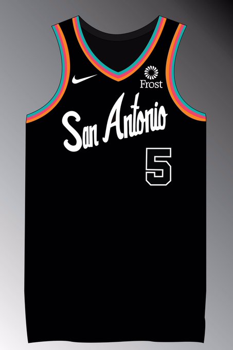
yeah...would buy all of these.
That gray one is a million times better than the current gray.

Yeah the current one is pretty bad. The black one with the fiesta is pretty cool, they could do black one year and white the next and then start doing each of the colors (kind of like Miami did black/white/pink/blue for the vice jerseys.)

The Spur have the best colors in the NBA that every other team tries to copy. Those fiesta colors looked like ass back then and remain so today.

I like all of these
Is this for sale?
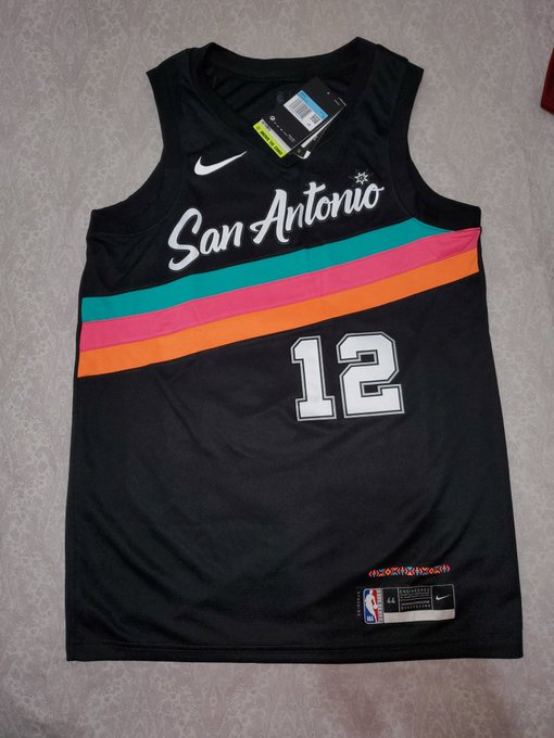
Based on twitter this is the Spurs' city-edition jersey...
As I've said before I'd rather have subtle fiesta colors , I actually like the color pattern right above the Nike patch at the bottom, I wouldn't mind that around the edges of the jersey similar to the photo below.


Not bad. I like the style of the font. I would buy one.

Need to make the number look more like the one on the Murray drawing but looks good overall
This is another style I would have preferred.

As long as that stupid camo is gone, they could bring back "Get Ready for this" for all I care.

What an amazing piece of leaked news if it turns out to be true. It might not be everyone's preferred interpretation of the Fiesta theme... But it's inarguably a step in the right direction, and far away from those god-awful camos. Hopefully forever. Now, just gotta hope these sell well enough to entice the FO to keep them coming...

Wouldn’t work without Stan Kelly’s voice.
There are currently 1 users browsing this thread. (0 members and 1 guests)
 Posting Permissions