Reply With Quote
It is a bad sign when you worry that the jerseys are going to be boring.

Just a concept. Not bad tbh.


It is a bad sign when you worry that the jerseys are going to be boring.


get Murray on that
They look similar to the jerseys that the West wore in the '96 all-star game in SA.

The colors aren't terrible but the lettering is hideous
Darn. I was hoping DeMar was getting traded away for a draft pick

It's about time!

I actually miss Stan Kelly. There. I said it.

Y’all ready for this?

No thanks

TIM DUNCAN! TIM DUNCAN! TIIIIIIM DUNCANNNN!!!!!
Still gives me chills.
Lmfao Jesus ing Christ
This looks like something a g league team would wear.

Side panels like that, but no aqua. Make the uniform 'base' black. A bunch of pastel colors won't stand out on a pastel color.

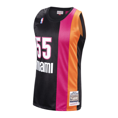
Heat jerseys last season were AMAZING!!! Our fiesta colours and a great intro...My fan-dream.
Heat fans knowing that was Wade's last season got very emotional with the intro every game.
Some cities have a sense of show that San Antonio need in this new era. I just hope the extrovert young guys like Lonnie and DJ help to change it.
So this kind of color scheme but add in the teal?

i'd be disappointed if this was what we got, this looks like an amateur take on a concept that's been floating the internet for years now

that looks nice. The blue green(?) is a no-go at this station, but thats my only gripe, the jerseys main color. Otherwise, amazing design.
if only we’d loved kawhi that much when he was here...hopefully he comes back...
Why would it hurt for me?

not sure why people have high expectations for this considering this is the same creative/entertainment department that came up with the camo jerseys, making it a co-ed spirit squad, using jock jamz '96 as the intro songs...

I think a white base would look better with the taco cabana colors than black imo. Teal could also look OK. Black doesn't really make those colors pop like it does the Miami Vice colors.

clever le i agree
There are currently 1 users browsing this thread. (0 members and 1 guests)
 Posting Permissions