

 Reply With Quote
The colors are cool to me. The logo on the court, however, makes me feel like I'm eating Tos os.

They look a little effiminate compared to the old black and silver. Anyone got info on how the players like the new colors.

The colors are cool to me. The logo on the court, however, makes me feel like I'm eating Tos os.

Nah, they're fire

we got new uniforms mid season?

Yeah but the team wearing it sucks even more

I think they're cool too but the font/script on this is too taco cabanaish.

Agreed. I like the colour scheme and accents but would have preferred a traditional script. This is a lil too looney tunes to me.
Overall good year for jerseys though but the SATX have to go.
Idiots.
spurs have the best color scheme out of all major league teams- silver and black
imagine having to use goty purple and gold or other lame colors…
yet the idiots in spurs mgmt have to up the one thing that the spurs have an advantage over any other franchise
ing idiots

Black Fiesta jerseys are the best ones this franchise has ever worn. Need to be permanent alternative kits somehow.
Im ready for them to go, and the floor as well. Reminds me of the flintstones.
They need to revisit the city additions from the past two years which were awesome:
https://spursfanshop.com/products/sa...hoCKq4QAvD_BwE

These unis are fine for this team.
Make em earn back the Silver & Black.

I like them, think they're great as occasional alternates. Of course I wouldn't want them full time. The ones I miss though are the grays from 2013 and the black on blacks from 2017.
Why do they change them at all? To get some additional sales of jerseys from fans???. There is something to be said for the tradition that Silver and Black represents, but I don't see anything for our future in Aqua. I seem to remember that the original move to use those colors (although mostly as stripes or something on the black background) was the idea of Charlene McCombs who thought they would be reperesentattive of the Fiesta colors in SA. Nice womanly touch.
Both of those bugged me, lol. They played out the grey ones, and I always thought the off centered spur looks jarring (and not in a good way). But anything is better than the military ones, yikes! Guess its in the eye of the beholder.
The 2020 city editions were the best in my view.
2017 black on black jerseys were fire

That right there.
There are some jersey collectors out there who will buy one of every edition no matter what it looks like, and probably more importantly you never know when a design will go viral. That makes allocating some of a team's budget to jersey design a worthwhile expense.

I was thinking tos os, but taco cabanaish is about right.

OP is right.

Yes.
Charlene came up with the basic fiesta colors/logo, but these unis were a nod to the Alamo Dome ASG unis.
Those were the days... My classmates and I got paid in sprite to paint some huge mural downtown right across from the Alamo Dome back in 8th grade. Got to hang and drink sprite with the Coyote. Good times!

Colorful, flashy third jerseys have been best sellers in many leagues for a while now. Look at all the pink or fluo yellow, third jerseys in soccer. Appeals to regular but also younger and feminine fan base that might not buy the traditonal jerseys... It's a business, they're not just gonna make "exotic" jerseys just for fun.
Last edited by JPB; 01-26-2023 at 01:59 PM.
Purple sprite double cup?

Like others have said they just needed to recycle those ol allstar unis
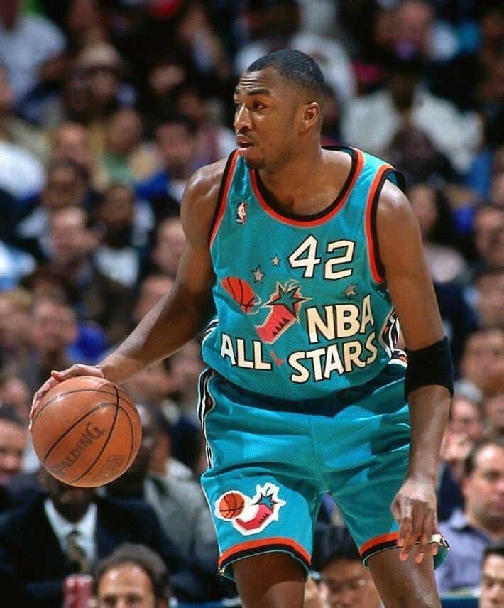
Of all the greats in that AS Game you chose Vin Baker?
There are currently 1 users browsing this thread. (0 members and 1 guests)
 Posting Permissions

