Reply With Quote
ok... I believe, I believe! ... and YES... we DO have to get those shots done~!

anybody else....?

ok... I believe, I believe! ... and YES... we DO have to get those shots done~!

sounds great. i leave for Canada July 22, so we can do it before then if you'd like, or when i get back, in August.

A few posters have alluded to it, but the emotional connection is what you're missing in the photos that don't involve the tennis star or dancer doing a hand stand. Everything LOOKS good, but the "timing" seems off and that's just something that comes with experience and taking more photographs I think. But yea, I haven't seen your other work but you know how to jazz it up and make it look good.
There was a photographer, did lots of wonderful stuff with B/W, named Henri Cartier-Bresson. His motto was "to master the instant." Just go around with a camera one day and try to capture an organic story, then see if you can make it jive with some of the spectacles you're doing professionally. It'll add a different element and keep you interested in your own work instead of dulling your senses as a photographer.

Your subjects need to show some emotion instead of acting like they are getting their picture taken. Photo #2 is too busy.
Nice job, better than anything I could do.

# 2 would be awesome if she were in a ghosttown with tumbleweed. just my opinion though.

why u poot mor pic teniz gurl? u teaszing me?..to bee onest, u'r vry good.

Send in some of your work.
http://sanantonio.craigslist.org/crg/1862282554.html

The pictures are great... never can fault a photographer for giving us an insight into his/her perspective.
I too, love the tennis picture. Your sister is beautiful and has the tone and physique to make the night shots work. You probably shouldn't have posted her name on this forum though.
I also love the skyhue in the basketball photo...

thanks, mouse! i think i'll do that.
thank you, i appreciate that.where did i post her name, though?
edit: nvm.her name really isn't "Natalia" (as per the caption of the image... i am careful with that, and changed her name)
thanks, though!
BTW, here are a few more pictures.. the first two were my "old style", and taking some of your comments into consideration (though to be honest, i had been struggling with this old style for a while, and i had been wanting to move away from it...), i have decided to change my style, just a tad bit.
enjoy, and critique again, please.

dude, you took a pic of a dude's ass...wtf...
thanks. probably like $5,000..
when i have EVERYTHING i will want (not including studio), it'll probably be closer to $50,000 in just gear.
i'm not gay if you're trying to make a pass at me...

All of these photos look like overdone senior pictures. This entire thread stinks of self gratification
I do like how you cover it up with I just want your feedback. Why do you just say what you really want to say like "hey, lookie what I can do!"
All of these photos look like overdone senior pictures. This entire thread stinks of self gratification.
I do like how you cover it up with I just want your feedback. Why dont you just say what you really want to say like "hey, lookie what I can do!"

In case you didnt get it the first two times.
I like it, looks very professional, like stuff you would see in a magazine.
I actually liked the swimming photos best for their artsy qualities. the others look very commercial, but that's a good thing.
thanks!
I'm no photography expert by any means, but the first one with the soccer player, the girl looks too washed out. Love the B&W one, which are usually my favorite types of photos anyway. Keep it up!
thanks S y! the soccer one isn't my favorite, either... i think i'm gonna take it off my website.
more:
i post my pictures here because i appreciate the honest and blunt critique of strangers that i don't know - people that (hopefully) aren't worried about hurting my feelings.
if you don't like that i post the pictures here, i apologize.
would you rather see the crotch? ...wtf+1


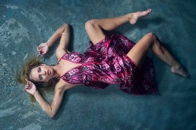
Were you going for designer drowning? I love everything but the feel. I think her expression could be softer and less cold/stagnant. The idea is brilliant, and the pose is wonderful, but I can't help but think it's a crime scene drowning.
Maybe just me?
Great creativity, though. Love the colors, and, even if it seems to conflict with my drowning statements, the stillness of the shot.
Last edited by JMarkJohns; 08-23-2010 at 01:23 AM.
The photo can't be truly appreciated on your monitor. there is nothing better than having a glossy 8x10 in your hands. So keep that in mind when you critique.
also the photographer shows creativity, why this guy doesn't have a major marketing company paying him to do magazine ads is mind boggling. either he has the worst agent in San Antonio or his ignorant ass doesn't have an agent.
either way the worth mistake is not having enough talent but having it and letting it go to waste, my 2 cents.
True, but the glossy look won't bring life to her cold facial expression. That's my only critique. I love the look otherwise.
There are currently 1 users browsing this thread. (0 members and 1 guests)
 Posting Permissions