
 Reply With Quote
neh, old one's better.


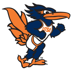
To be fair, their new one isn't bad.
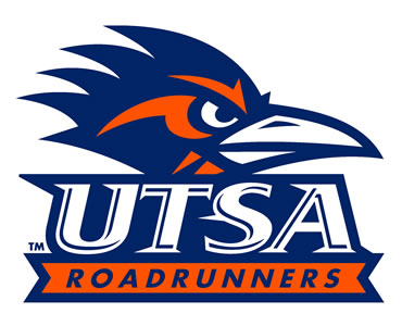

neh, old one's better.


Bulls and Heat, tbh.

maybe, if they were called the Dallas gots

Lots of good ones...

i do like the new golden state ones.
like the jazz
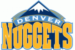
also like nugg's alternate in my avatar, don't like their primary though.
the raptors claw as maple leaf is a nice idea, not a huge fan of it's execution though


Of main logos, I like the Blazers logo because it's just plain and simple, without fancy stuff.
and these alternate logos;


da Bulls

U mad brah? Go out eat , you pussy deprived got.
Since we are on the topic of logos, why not mix it up for the worst logos as well.

That just means it's a flaming ball of .
Yeah, I have to agree, it is basically a contest between the Bulls and nobody else...
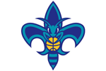
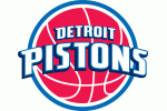
Lakers and Celtics and clippers don't really have 'logos' other than word art. Not bad, but not great. I was partial to the 80's Pistons logo, but the current one isn't as good. I used to like the 98 Jazz logo too, but the current 'retro' logo kind of sucks.

Everyone is wrong. It's obviously this one:


Even fewer lakes in LA...and I actually like the Warriors logo.


i love these too


Bulls, but only upside down.
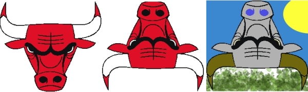
All hail the reading Robot on a Bank!
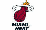
best by far, dats da real logo 4 any south beach team sons.


that's kinda funny
I like the two brunette chicks, but the blonde dude on the right ruins it.

That's pretty awful, tbh.
Bulls is the best, no contest.

Manu > Logos

Mono's off his meds, or his blowup manu doll sprung another leak.
There are currently 1 users browsing this thread. (0 members and 1 guests)
 Posting Permissions