

 Reply With Quote
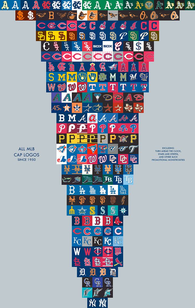
I always liked the Brewers glove representing an M and a B for Milwaukee Brewers.

thoughts?

I always liked the Brewers glove representing an M and a B for Milwaukee Brewers.
Smiling Oriole is dope.

Gotta go with the elb logo.
I like the 3rd and 4th Chicago Bears logo.

5th row, 2nd from the right
lol 1919

Yeah..always been my favorite too.
Wait, what??? I never knew that it was an M and B before now.

What happened to the baseball forum?


Too bad the team sucks


I like the Giants SF logo and the Reds logo.
I guess the Expos hat is very popular
A bunch of dudes in the U.S wear it
I do think the Expos logo is ugly though

nationals W imo
I bet you like the Dallas Cowboys too, don't you, frontrunner?

Yankees, not even a matter of opinion.

i was gonna say the simple brewers logo before i knew it spelled out mb
I'm glad I'm not the only one who never knew that.
I don't even like baseball or football

Best one up there is the lower case a for Atlanta.

Yankee logo is the GOAT, anyone who disagrees is a hipster d-bag.

The smiling red Indian for Cleveland, politically incorrect or not. And when the Major League movies came out, that was . And I'm a Tigers fans and I think it looked cool.

^^^ as a Native American i love the logo

As with all major decisions in my life, I take my cues from Magnum P.I. Old school Tigers logo wins.

The Red Sox logo w/ the two, um, red socks, was always classic to me.
There are currently 1 users browsing this thread. (0 members and 1 guests)
 Posting Permissions

