


 Reply With Quote
just a navy version of the P. Diddy alternates
but i like


just a navy version of the P. Diddy alternates
but i like

Not bad, but I still like the original green ones in that style the best.

Someone has to post the trashbags.
sacrilegious not to.

I don't get the connection but OK...

hard to find pics because they only wore them one game but here ya go Mex

^ Is that "There's no fours!"??


Green P diddys and royal blue diddys from 2 years ago were best tbh

Honestly the mavs' graphic designers are pretty inept. Whoever picked the font for that jersey should be fired.
Only pussies & assholes give a hearty about uniforms.

tbh I liked the actual color of the trashbag uni's, and the fact that it had the entire word Mavericks written on it.
It was just the excessive shininess and the excessive bagginess that made it so re ed looking.

Agreed, they should have used a more muted gray instead of that shimmering material.
yeah the full "Mavericks" was pretty cool to see
oooh those are cute!
I like it:
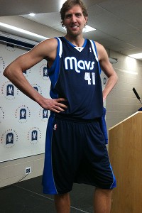

I've always thought the P.Diddys would look cool in white with royal blue lettering. Keep thinking thats where they are going next.

Dr. Frank-N-Furter pose.
Agreed.
Some of these guys are half a though, talking about shoes, blouses and handbags.
There are currently 1 users browsing this thread. (0 members and 1 guests)
 Posting Permissions

