

 Reply With Quote
eh, it's alright


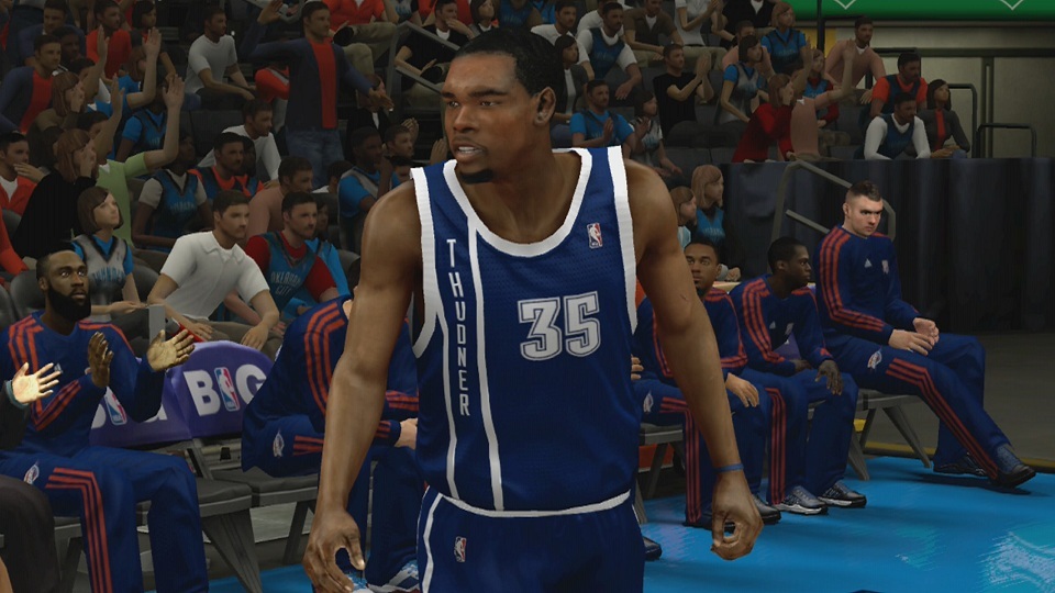
Vertical text

eh, it's alright

Actually it's better than the Spurs'

I dunno, it looks pretty bad to me.
The Spurs' uniform at least incorporated team colors into its ty design.
This looks like some offbrand navy blue or something. The vert text is really what seals it for me though. looks terrible.

I think it's way better than their standard road gear, which makes it a couple order magnitude better than the Spurs ty grays; only Houston can claim a jersey as lame as those.
Thudner?

Cyber Harden looks super focused on killing a mosquito.

Are we the only ones that noticed this?
Last edited by TimDunkem; 10-10-2012 at 02:46 PM.
Is this a mod or something? 2k can't be this stupid, right?
You guys are idiots. The jerseys are nice.
I hope so.
This is a pretty simple yet big up. I wonder what else they misspelled? lol

re s... maybe it was Jay-Z's fault.

That sucks, looks like an AAU team, tbh...


looks like a CYO uni

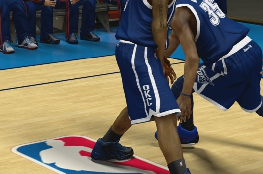
When did Durant grow muscles and become asian?

spurs got new uniforms?

team walmart lol

Trying too hard

Better than their old one that looked like a YMCA league jersey
looks more like practice jersey tbh


Better than the Spurs imo. That color combo sucks though.
Thudner?
There are currently 1 users browsing this thread. (0 members and 1 guests)
 Posting Permissions