Reply With Quote
That's a fake.
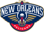
The new colors are red, gold, and navy blue.


That's a fake.
The new colors are red, gold, and navy blue.


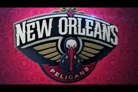
We shall see. It came from Chris Creamer's site. In the picture the Pelican's beak looks slightly orangish but if you count it as red then the colors match.

Wouldn't be surprised if the logo was a real life picture of BR
Its an old picture. Red and gold are supposed to be primary.
Maybe your right. I'm hearing its that too.

tbh I thought for sure Pelicans was the worst name anyone could ever come up with, but holy dayum they came up with a handful of worse ones(Pelicans, Rougarou, Mosquitos, Swamp Dogs and Bullsharks)

all these logos; I'm hoping they follow Jayz's lead and make it boring as . "Pelicans" on the jersey in comic sans with the team colors alternating on each letter and the logo will be the outline of a pelican; then have the name and logo inside of a square. The hipsters will eat that up

That's it:
In a later post the user further explains that the primary logo will be the same as the one shown on the cap but with “NEW ORLEANS” across the top in white with a small red fleur-de-lis and “PELICANS” in white with a red background rounded at the bottom.
That looks horrible.

Not bad, they could have done a LOT worse, tbh...

at least it's better than Brooklyn's .
Or OKC's, for that matter
I like the minimalism of the Nets logo set. The NOLA looks too flamboyantly gay. They might as well have renamed the team the New Orleans Tennessee Williamses.

Not the best they could have done but it's not the Bucks, the Brooklyn Spurs or the Thunder either.

I like it; I think it's a pretty slick logo and a huge improvement from the Hornets. Even better if Charlotte takes the Hornets name to get rid of the Bobcats crap.

And in the locker room

Not bad.
I give it about a 6.5-7...with zero being the one that asslicker posted in the thread he made and 10 being the one Clipper Nation suggested.
Seriously though, it will be good to see them get back to playing real ball again after a couple more lottery seasons.
I'd give it 8.5, as one of the better logos in the league. It's certainly better than these abominations:


Definitely not at level of the best ones though


Last edited by baseline bum; 01-24-2013 at 03:28 PM.

s wack

it sucks imho
you forgot the Nets as the one ty logo to rule them all.
There are currently 1 users browsing this thread. (0 members and 1 guests)
 Posting Permissions