
 Reply With Quote
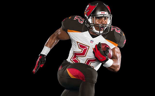
Gross


Gross


Wow that's muy feo...


I like it.
Really? That orange swath on the side of the leg looks re ed...I guess if you took that off I'd be okay with it. What do the home unis look like?

The numbers remind me of an alarm clock but the rest of it is fine, tbh.....
They didn't show. It's supposed to be traditional by bringing the bolder (orange) back. I suspect they will have a red or orange jersey for home and like a black one for the alternate.

looks like some out of the XFL
He Hate Me on the back! This is true...or AFL...or some Division II uni...

I like it tbh. Bucs logo is a little large on the helmet but I think they look sick
I'm fine with the logo being big but the color scheme is what irks it for me.

Damn why?


i think thats pretty cool


well they do belong in the arena league


Exactly what I said when I first saw them...


The alarm clock font on the numbers just doesn't work.

the fact that it looks like an arena league uniform makes it fitting, seeing that they're pretty much an arena league team.

who's the in your sig?
stana katic


So Seahawk fan has a problem with how noisy and unnecessary uniform design is? Really?


Horrible.
Now that they've been around a little while the Seahawks unis seem normal, but yeah back when they first came out they were even worse than this. These at least have a decent color scheme, but otherwise are pretty Arena League.
I just don't get teams who feel the need to idiocracy up their uniforms. Classic, clean, and simple always works. These are 90% of the time a terrible miss.


They look fine. They'll probably look a lot better when we can see the full profile, front and back. Only thing I'm not a real big fan of are the numbers, they look like an LED clock reading.
Have I touted the Seahawks unis as the best in the league? No. I like them but I don't love them. In fact, my favorite rendition is their road white jerseys and blue pants...
There are currently 1 users browsing this thread. (0 members and 1 guests)
 Posting Permissions

