Reply With Quote
Too bad they still suck.


Not bad


Too bad they still suck.
Can you wait until after Jordan blows another draft to say such hurtful things?

I hope BR got his name changed.

its not bad looking. feels like its missing something though.
its gonna take me awhile to warm up to the new logo. i'm really partial to the original one.

+1
The pinstripe jersey looked better too


Gettin' up off his ass 0-2 has him frazzled.
tee, hee.

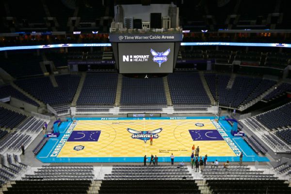
Looks great tbh. Wasnt sure about the jerseys but they got the court right.

Stupid teal colour reminds of the 90's....not a good look TBH. The court is nice looking from a layout standpoint.

I like the old school vibe. Good to see the Hornets back home.
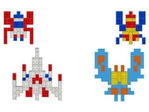
Pelicans

Hornets back where they belong. I expect good things from Charlotte this year. Iden y change hopefully turns things around for them.

lol Charlotte Galagas
lol airport called CLT.. we're flying into clit.

Nice. Hornets back where they belong, looks good.

I like it. Wouldve been cool if they went with this though:


They should make that blue color that surrounds the court black tbh..

That honeycomb pattern is cool.
definitely. those original hornets jerseys might just be my favorite jersey design of all time..

The new Hornet looks like it's on crack. The original Hornet was badass.


Since there is no Pelican's tag...
Pretty dope.
Wtf
There are currently 1 users browsing this thread. (0 members and 1 guests)
 Posting Permissions