Reply With Quote
my favourites..
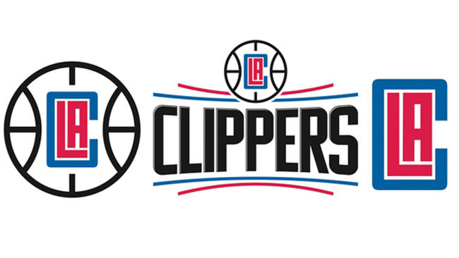
(Clippers current logo compared to this)


Mostly good by this dude..
https://www.behance.net/gallery/2884...ogo-Redesigned
my favourites..
(Clippers current logo compared to this

His Spur logo looks good. Don't like his Laker logo though.

The Minny logo looks a bit like Firefox... But nevertheless slick redesigns

I like them tbh.
I still can't get over who OK'ed this garbage for Clippers..
Slick. I like most of them.

Good stuff. My favorite is the Hawks. Clippers gets the award for biggest upgrade over the current logo.
I didn't like any of the redesigns of the classic logos: Celtics, Bulls, Knicks, Lakers. I also thought that the Portland one was too bland and the Magic one was creative but not executed well.
Nearly all of these would make great secondary logos.

Agreed - Hawks was the best one. Just all around clever and looks great.

Orlando is dog .

I like his style.

How about the new owner, who also owns Microsoft and essentially wanted to emphasize or even brand the team that way.


grizzles, kings, hornets, bucks >>> nets, mavs, rockets, pelicans
everything else is uninspiring.
his timberwolves logo is awful. their secondary logo needs to be their primary one, why it isn't is beyond me:


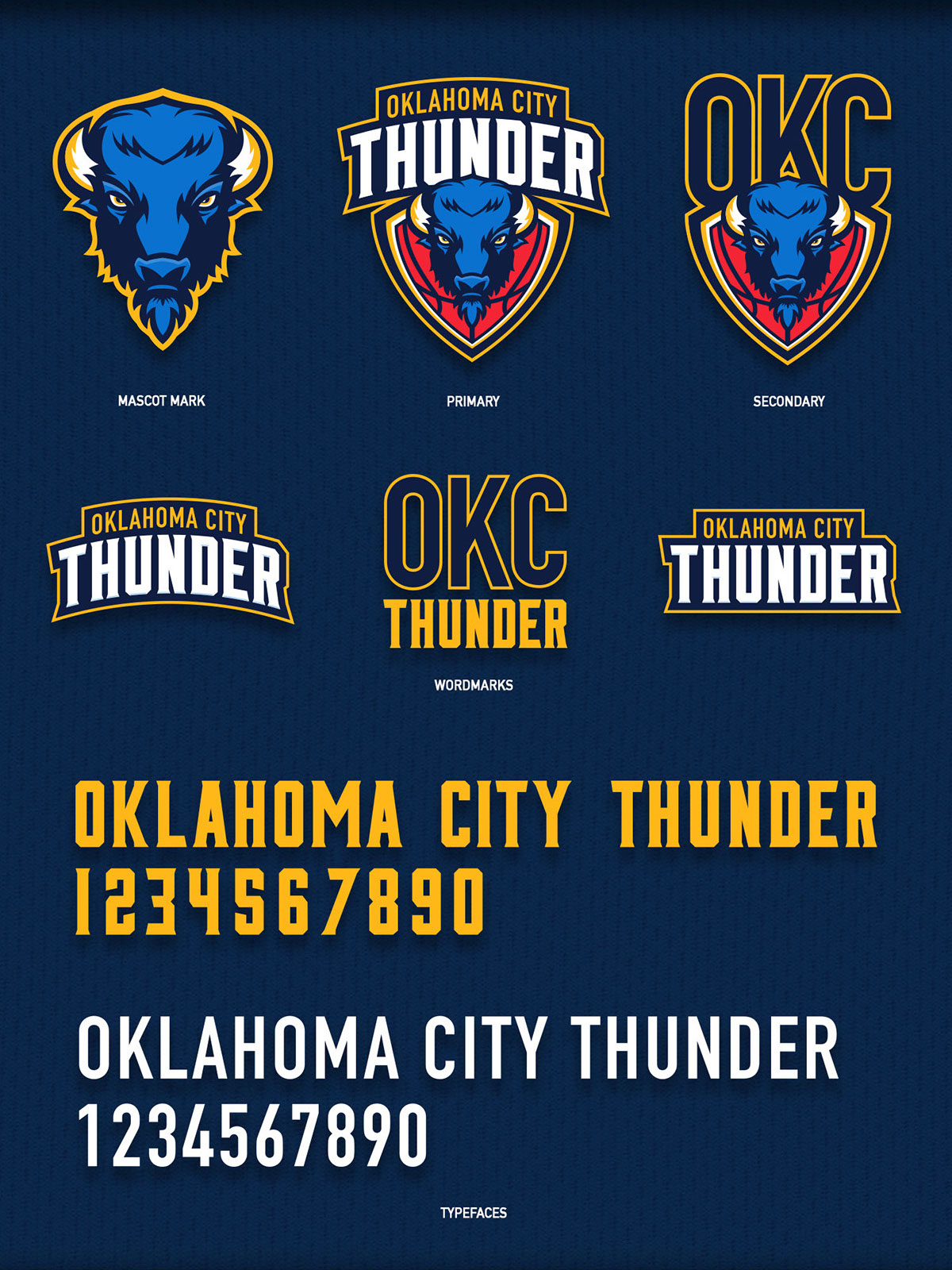
Thunder looks like a buffalo sitting on buffalo .

lol Clippers sinking ship
OKC really misses Harden

logos besides the Atlanta, pelicans and rockets tbh. Those are dope
Rest suck

That one is terrible


lakers should be etched on a tombstone.

Magic, Raptors, Kings, Suns are abominations
Hawks, Bucks are great

How about spurs ??

They should put the clippers upside-down like the Poseidon.
the font terrible but the Alamo background is good idea..could be refined better..

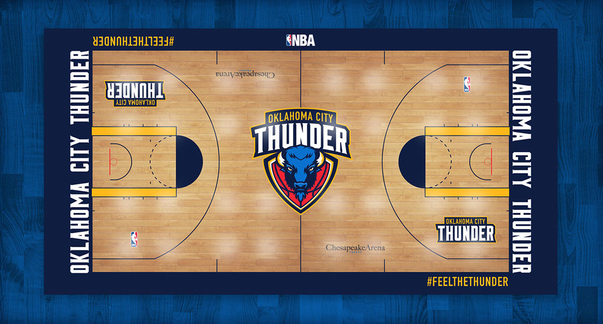
This website (art section) has some cool team rebrands..they have done 4 teams already ..Loved the Thunder's rework..
http://hoopeduponline.com/2016/03/12...ncept-rebrand/
There are currently 1 users browsing this thread. (0 members and 1 guests)
 Posting Permissions