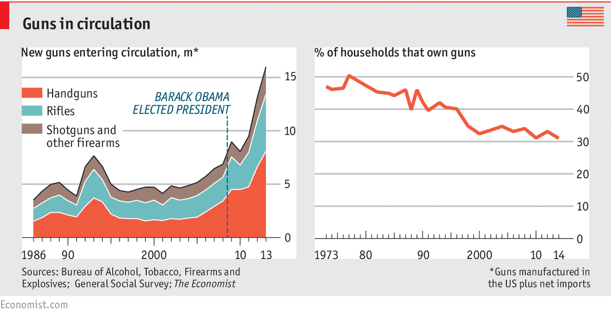
No, I'm not. I'm saying the graph is misleading because it compares a % to a total.
Pick a lane, dude.
boutons said "more guns means more gun violence," as you quoted. When I pointed out that TSA's graph showed rate vs. raw numbers, you argued that "more guns" meant more total gun purchases. That's fine. But now you're telling me that "more gun violence" means a higher rate of gun violence, so you're the one doing the inferring.
There are two meaningful ways to present a chart in response to "more guns means more gun violence."
1. Total guns purchased vs. total acts of gun homicides over time
or
2. Gun ownership rate vs. gun homicide rate


 Reply With Quote