Reply With Quote
I agree.

Damn BM20, that looks badass
I agree.

THanks for the upload.
This design is very apparel friendly.
I will endeavor to grab a gray Nike shirt with this plastered on the front come August 1st.
No dude, this:
What is that supposed to be? A badge? A Buckle?
I like the added spur logo in the middle. Maybe change the black inside the ball to gray and the gray stripes to black.
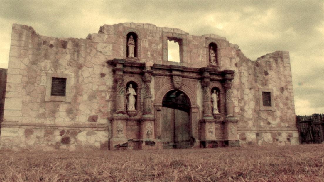
Ah okay. So I actually always thought the silhouette was to resemble the Alamo building... like the tapered pattern on the corners.
But I just googled a photo of the Alamo and it's not even close.
So yeah what a mystery. Wonder if it was ever explained in 2002.
The tapered pattern make it look like a fortress indeed. Maybe it represents some of the fortress ruins? Before some restoration or something?

It is supposed to replicate old fashioned business signage from a pre-commercialized era. A "mom-and-pop" corner general store style sign. It was supposed to make reference to the Spurs unchanged and uncompromised way of basketball and business since their inception. THE 2002 LOGO WAS ICONIC, UNIQUE, AND ONE OF THE GREATEST WORKS OF ART IN HUMAN HISTORY. IT WAS THE EMBODIMENT OF THE SPURS FRANCHISE IN EVERY WAY. IT SHOULD NOT HAVE BEEN CHANGED AND IS A TIMELESS LOGO IN THE SAME WAY THAT THE BULLS, CELTICS, AND LAKERS LOGOS ARE. I AM GOING TO WRITE A LETTER OF PROTEST TO THE SPURS AND TO THE LEAGUE. THIS WAS NOTHING MORE THAN A CORPORATE MANUFACTURED MOVE TO BOOST JERSEY SALES AND A COWARDLY DISPLAY OF BANDWAGONING TO A MODERN TREND. THE PRIDE OF OUR STATE AND OUR CITY HAS BEEN PROS UTED TO THE HIGHEST BIDDER.

What an upgrade

Everyone ed each time the logo was changed and everyone got over it. They arent getting rid of the spur people!

Found these posted on a logos message board.


I think they should detach the stripe down the middle of the $
You really want to send a message, don't buy any of the new gear , let's sales drop off, they will get the hint and go back to the old logo.
Where is the best place near river walk to get tattoo?

This top one needs to be the one.

Hate the gray of it!!
Wish they'd keep it Silver!!
I didn't even notice that. Maybe to keep it consistent with those gray alts they've worn these last 5 years.

Some news on the NBA jerseys for the upcoming season
https://www.cbssports.com/nba/news/l...-nike-jerseys/

Prob the Bexar County Jail. Just say you're Tango Orejon.

Prisons have better tattoo artists than jail, tbh.


The 2002 logo and jerseys are awesome, don't see why they needed a logo change other than to sell more hats, jerseys. How different will the uniforms look? I hope it still has the classic Spurs look to it.
There are currently 1 users browsing this thread. (0 members and 1 guests)
 Posting Permissions
 this is such ass. Horrible.