


 Reply With Quote
Weren't the Denver Nuggets the Rockets in the ABA and they had to switch their nickname with the merger as it was aleady spoken for by Houston?

Just for fun.
Top 10 ABA Logos
10- Indiana Pacers
Even though the Pacers' logo looked like a giant, elbowless arm that looked like something from the minds of Hanna-Barbara, you can't deny the simple design. See, the extended arm and "basketball" form the shape of a "P." Pure genius! Back in the day I always thought this logo was ugly, but now I'd love to see teams dumb-down their logos. Sometimes it's good to let the masses use their imaginations. For example, I always thought the "basketball" in this logo looked more like a tennis ball.
9- San Diego Sails
I still think the Los Angeles Clippers could move back to San Diego and no one would even notice. In fact, they should move back to San Diego to get out of the Lakers' shadow. And while they're at it, they could change their name....
8- San Diego Conquistadors
...Perhaps the Clippers could become the Conquistadors once more. The thing is, are you scared of a clipper ship? Not really, nobody is. But would you want to confront an angry conquistador? I didn't think so. As a bonus, they could dress Bill Walton up and he could be the mascot. Not only would that be the best idea the NBA has ever come up with, but I think that would be the best idea in the history of all mankind.
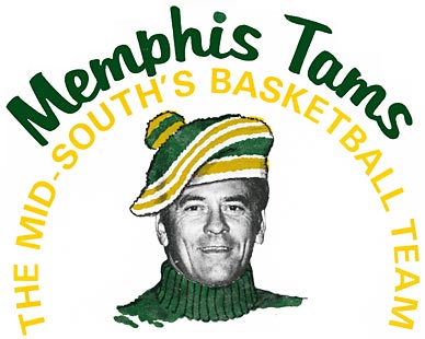
7- Memphis Sounds
Hey Grizzlies! Maybe you should turn your whole franchise on its head too. You see, when I hear the word "Grizzlies" I don't automatically think of Memphis, Tennessee, and vice versa. Memphis has always been known for its historical impact on the world of music. So, changing back to the Memphis Sounds and using this logo would be perfect.
6- Spirits of St. Louis
This logo was based on the Spirit of St. Louis flown by the legendary Charles Lindbergh. I think if St. Louis ever gets an NBA franchise they should name them the Spirits of St. Louis all over again. Except this time, "Spirits" would refer to ghosts. Nowadays everybody is in love with ghosts so it would be perfect.
5- Miami Floridians
I don't know why this logo works, but it does. Purple and orange don't make a very manly color combination, but you can't argue that these colors don't conjure up images of Florida and it's eclectic culture. I'm glad the Miami Heat regularly pull the old Floridian uniforms out--and I'm also glad they came up with a better name than Floridians. That's just lazy.
4- Los Angeles/Utah Stars
The swooshing font symbolizes that the Los Angeles Stars were a team of action. They weren't just going to sit back and let other teams push'em around. No, these were the Stars and they were a team on the move....
....literally. See, the Los Angeles Stars eventually relocated to Salt Lake City. Being that I am from Salt Lake City, I'm real proud that the Stars eventually won an ABA Championship, but the problem is, Salt Lake City doesn't have a lot of movie stars. Sure, sometimes we can see the stars in the sky, if the pollution has cleared out by sundown, but most of the time we can't even see them. No, after relocating they should have renamed the team to something that would make more sense. You know, kind of like the Jazz.
3- New York Nets
I could do without Basketball Joe there showing off his patented dribbling, but other than that, the New York Nets logo had a real classic look--even back then. I'm hoping that when the New Jersey Nets move to Brooklyn, they'll look back and refer to this in some way.
2- Denver Nuggets
I wonder if Denver has ever heard the phrase, "If it ain't broke, don't fix it." The reason I ask is because this logo is one of the best in sports history, but for some reason the franchise decided to go with one of the ugliest in sports history when they decided to switch to the rainbow skyline look.
1- San Antonio Spurs
The fact that the San Antonio Spurs still use this logo shows just how good it is. Simple, yes. Effective, yes. This logo immediately lets you know where the team is from and accurately communicates vital information about the Southwest, like people in San Antonio are constantly wearing spurs on their boots.

Weren't the Denver Nuggets the Rockets in the ABA and they had to switch their nickname with the merger as it was aleady spoken for by Houston?

I don't think so... but I'm not sure.
Those are some pretty cool logos though.

Neither of the ABA S.D. franchises became the Clippers. The NBA Buffalo Braves up and moved to S.D. one season, and years of futility were born. As for the Clippers moving, Donald Sterling wouldn't hear of it. He wouldn't even take a sweetheart deal from The Pond in Anaheim. Too far for his friends to drive. True story
http://www.basketball-reference.com/teams/
They switched one season prior to the merger. You are more correct than I.

at the Floridians owning the Mavs

2- San Diego Sails
1- San Antonio Spurs


No Kentucky Colonels? Virginia Squires???

lol

No way. The best ABA logo was the one from back when Bob Bass was a pimp on the side...

some of these team names WTF??
i mean, the sails...
the spurs logo is by far the best
its still fantastic and relevant today
For real, that San Diego logo is sweet.

Floridians?! WTF?!

That Nuggets logo is tacky as all get-out.
Dang talk about bringing back old memorys. And I just seen leatherheads as well. Im just happy we got rid of all those girls fiesta colors we used to wear. Bright Pink and Baby Blue never looks good on men who combat against other men.
There are currently 1 users browsing this thread. (0 members and 1 guests)
 Posting Permissions