

For the 2015/16 Season.
Only shot available of the new unis. Will be unveiled later.

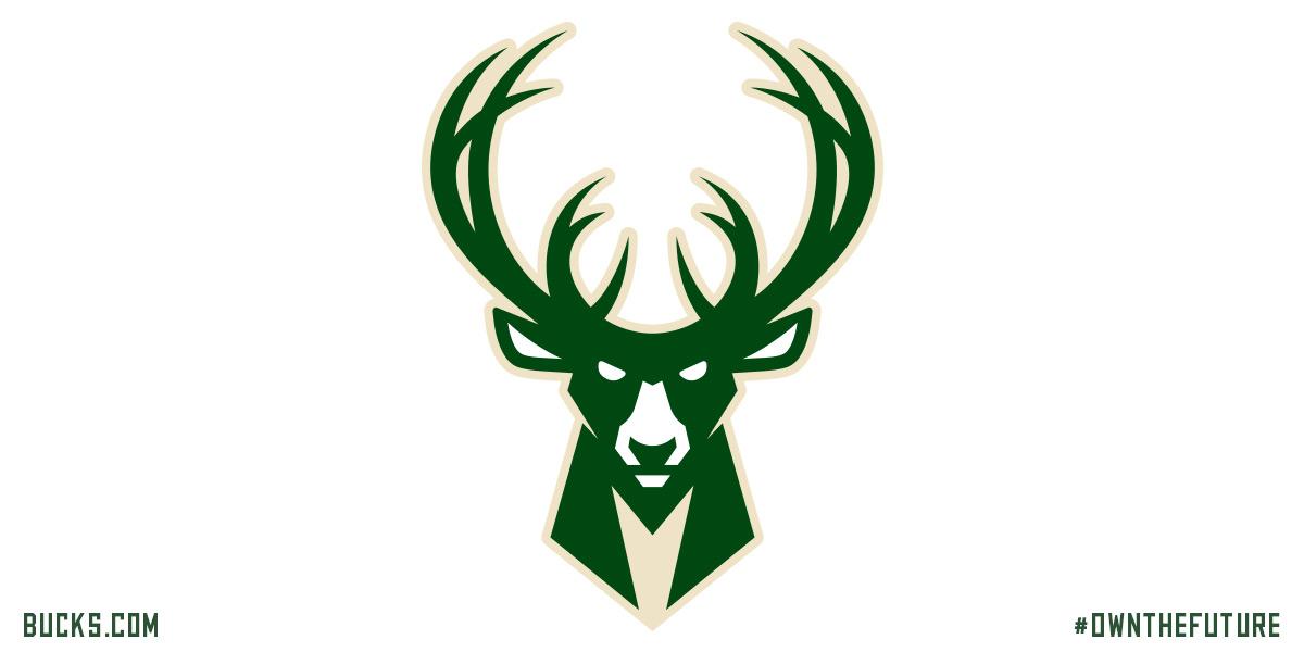
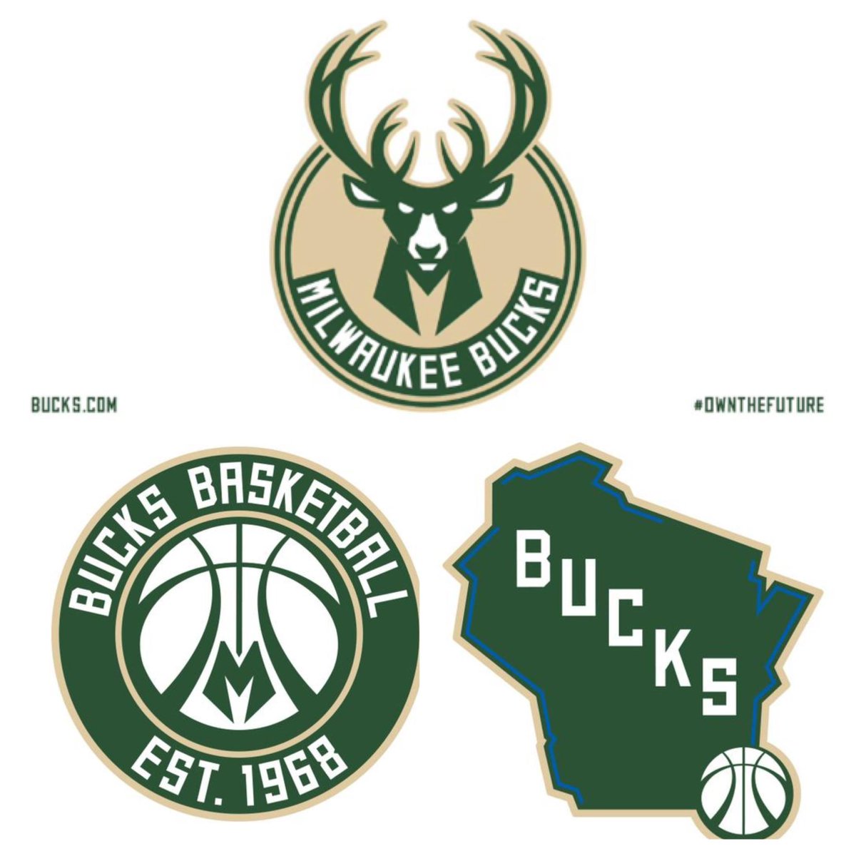
Once you notice the "M" in the neck, it can't be unseen, tbh.


Jamal should be their logo imho


And the basketball formed by the lower antlers. Pretty badass logo.

Much better than the atrocious rumored logo from a few weeks ago, tbh..
Yea I actually really like these new logos. They're a significant upgradeover their current ones and the ones they had before those.


That's a mean looking deer.

I approve...
nice new logo


The jersey is horrible

I like those colors.

not good enough.
they've had a ty color scheme since i've been a fan of the nba.

Let's all agree that with the Bucks colors scheme and logo there isn't much you can do in terms of cool looking stuff.

That logo is bad ass, agreed.I like the logo and the other stuff above, but the jersey is pretty bad.

The issue is their 3rd color
90s: Purple
2000s: Red
Now: Blue?
What's wrong with just green and gold? 3rd color should be black, white or grey.

The jersey would be nice if "BUCKS" wasn't outlined in blue. It even looks good on the sleeves but not on Bucks.
Wizards new primary logo. Should go back to the Bullets, tbh.


why is there a sword or obelisk in there?

Oh its an obelisk? Thought it was symbolism as to how Washington D.C. keeps anal raping the citizenry? It's for the George Washington monument, yo.
They don't even have anything to do with Wizards in their logo though. THey need that if they are called the wizards.

Bucks change logos and colors every few years.
Hawks new primary logo:


The Hawks have so many good looks that they could go back to IMO.. I even like the red and black ones with the Hawk across the chess they worse in like 95 for a couple of seasons.
There are currently 1 users browsing this thread. (0 members and 1 guests)
 Posting Permissions


 Reply With Quote
